
侧边栏是构建起来最复杂的组件之一。它是任何应用的核心,往往包含许多可活动的部件。
现在我们拥有了坚实的基础,可以在其之上进行构建。可组合、可设置主题、可定制。
安装
"use client"

import * as React from "react"
import { cva, type VariantProps } from "class-variance-authority"
import { PanelLeftIcon } from "lucide-react"
import { Slot } from "radix-ui"
import { cn } from "@/lib/utils"
import { useIsMobile } from "@/hooks/use-mobile"
import { Button } from "@/components/ui/button"
import { Input } from "@/components/ui/input"
import { Separator } from "@/components/ui/separator"
import {
Sheet,
SheetContent,
SheetDescription,
SheetHeader,
SheetTitle,
} from "@/components/ui/sheet"
import { Skeleton } from "@/components/ui/skeleton"
import {
Tooltip,
TooltipContent,
TooltipProvider,
TooltipTrigger,
} from "@/components/ui/tooltip"
const SIDEBAR_COOKIE_NAME = "sidebar_state"
const SIDEBAR_COOKIE_MAX_AGE = 60 * 60 * 24 * 7
const SIDEBAR_WIDTH = "16rem"
const SIDEBAR_WIDTH_MOBILE = "18rem"
const SIDEBAR_WIDTH_ICON = "3rem"
const SIDEBAR_KEYBOARD_SHORTCUT = "b"
type SidebarContextProps = {
state: "expanded" | "collapsed"
open: boolean
setOpen: (open: boolean) => void
openMobile: boolean
setOpenMobile: (open: boolean) => void
isMobile: boolean
toggleSidebar: () => void
}
const SidebarContext = React.createContext<SidebarContextProps | null>(null)
function useSidebar() {
const context = React.useContext(SidebarContext)
if (!context) {
throw new Error("useSidebar must be used within a SidebarProvider.")
}
return context
}
function SidebarProvider({
defaultOpen = true,
open: openProp,
onOpenChange: setOpenProp,
className,
style,
children,
...props
}: React.ComponentProps<"div"> & {
defaultOpen?: boolean
open?: boolean
onOpenChange?: (open: boolean) => void
}) {
const isMobile = useIsMobile()
const [openMobile, setOpenMobile] = React.useState(false)
// This is the internal state of the sidebar.
// We use openProp and setOpenProp for control from outside the component.
const [_open, _setOpen] = React.useState(defaultOpen)
const open = openProp ?? _open
const setOpen = React.useCallback(
(value: boolean | ((value: boolean) => boolean)) => {
const openState = typeof value === "function" ? value(open) : value
if (setOpenProp) {
setOpenProp(openState)
} else {
_setOpen(openState)
}
// This sets the cookie to keep the sidebar state.
document.cookie = `${SIDEBAR_COOKIE_NAME}=${openState}; path=/; max-age=${SIDEBAR_COOKIE_MAX_AGE}`
},
[setOpenProp, open]
)
// Helper to toggle the sidebar.
const toggleSidebar = React.useCallback(() => {
return isMobile ? setOpenMobile((open) => !open) : setOpen((open) => !open)
}, [isMobile, setOpen, setOpenMobile])
// Adds a keyboard shortcut to toggle the sidebar.
React.useEffect(() => {
const handleKeyDown = (event: KeyboardEvent) => {
if (
event.key === SIDEBAR_KEYBOARD_SHORTCUT &&
(event.metaKey || event.ctrlKey)
) {
event.preventDefault()
toggleSidebar()
}
}
window.addEventListener("keydown", handleKeyDown)
return () => window.removeEventListener("keydown", handleKeyDown)
}, [toggleSidebar])
// We add a state so that we can do data-state="expanded" or "collapsed".
// This makes it easier to style the sidebar with Tailwind classes.
const state = open ? "expanded" : "collapsed"
const contextValue = React.useMemo<SidebarContextProps>(
() => ({
state,
open,
setOpen,
isMobile,
openMobile,
setOpenMobile,
toggleSidebar,
}),
[state, open, setOpen, isMobile, openMobile, setOpenMobile, toggleSidebar]
)
return (
<SidebarContext.Provider value={contextValue}>
<TooltipProvider delayDuration={0}>
<div
data-slot="sidebar-wrapper"
style={
{
"--sidebar-width": SIDEBAR_WIDTH,
"--sidebar-width-icon": SIDEBAR_WIDTH_ICON,
...style,
} as React.CSSProperties
}
className={cn(
"group/sidebar-wrapper flex min-h-svh w-full has-data-[variant=inset]:bg-sidebar",
className
)}
{...props}
>
{children}
</div>
</TooltipProvider>
</SidebarContext.Provider>
)
}
function Sidebar({
side = "left",
variant = "sidebar",
collapsible = "offcanvas",
className,
children,
dir,
...props
}: React.ComponentProps<"div"> & {
side?: "left" | "right"
variant?: "sidebar" | "floating" | "inset"
collapsible?: "offcanvas" | "icon" | "none"
}) {
const { isMobile, state, openMobile, setOpenMobile } = useSidebar()
if (collapsible === "none") {
return (
<div
data-slot="sidebar"
className={cn(
"flex h-full w-(--sidebar-width) flex-col bg-sidebar text-sidebar-foreground",
className
)}
{...props}
>
{children}
</div>
)
}
if (isMobile) {
return (
<Sheet open={openMobile} onOpenChange={setOpenMobile} {...props}>
<SheetContent
dir={dir}
data-sidebar="sidebar"
data-slot="sidebar"
data-mobile="true"
className="w-(--sidebar-width) bg-sidebar p-0 text-sidebar-foreground [&>button]:hidden"
style={
{
"--sidebar-width": SIDEBAR_WIDTH_MOBILE,
} as React.CSSProperties
}
side={side}
>
<SheetHeader className="sr-only">
<SheetTitle>Sidebar</SheetTitle>
<SheetDescription>Displays the mobile sidebar.</SheetDescription>
</SheetHeader>
<div className="flex h-full w-full flex-col">{children}</div>
</SheetContent>
</Sheet>
)
}
return (
<div
className="group peer hidden text-sidebar-foreground md:block"
data-state={state}
data-collapsible={state === "collapsed" ? collapsible : ""}
data-variant={variant}
data-side={side}
data-slot="sidebar"
>
{/* This is what handles the sidebar gap on desktop */}
<div
data-slot="sidebar-gap"
className={cn(
"relative w-(--sidebar-width) bg-transparent transition-[width] duration-200 ease-linear",
"group-data-[collapsible=offcanvas]:w-0",
"group-data-[side=right]:rotate-180",
variant === "floating" || variant === "inset"
? "group-data-[collapsible=icon]:w-[calc(var(--sidebar-width-icon)+(--spacing(4)))]"
: "group-data-[collapsible=icon]:w-(--sidebar-width-icon)"
)}
/>
<div
data-slot="sidebar-container"
data-side={side}
className={cn(
"fixed inset-y-0 z-10 hidden h-svh w-(--sidebar-width) transition-[left,right,width] duration-200 ease-linear data-[side=left]:left-0 data-[side=left]:group-data-[collapsible=offcanvas]:left-[calc(var(--sidebar-width)*-1)] data-[side=right]:right-0 data-[side=right]:group-data-[collapsible=offcanvas]:right-[calc(var(--sidebar-width)*-1)] md:flex",
// Adjust the padding for floating and inset variants.
variant === "floating" || variant === "inset"
? "p-2 group-data-[collapsible=icon]:w-[calc(var(--sidebar-width-icon)+(--spacing(4))+2px)]"
: "group-data-[collapsible=icon]:w-(--sidebar-width-icon) group-data-[side=left]:border-r-2 group-data-[side=right]:border-l-2",
className
)}
{...props}
>
<div
data-sidebar="sidebar"
data-slot="sidebar-inner"
className="flex size-full flex-col bg-sidebar group-data-[variant=floating]:rounded-lg group-data-[variant=floating]:border-2 group-data-[variant=floating]:border-sidebar-border group-data-[variant=floating]:shadow-md"
>
{children}
</div>
</div>
</div>
)
}
function SidebarTrigger({
className,
onClick,
...props
}: React.ComponentProps<typeof Button>) {
const { toggleSidebar } = useSidebar()
return (
<Button
data-sidebar="trigger"
data-slot="sidebar-trigger"
variant="ghost"
size="icon-sm"
className={cn(className)}
onClick={(event) => {
onClick?.(event)
toggleSidebar()
}}
{...props}
>
<PanelLeftIcon className="cn-rtl-flip" />
<span className="sr-only">Toggle Sidebar</span>
</Button>
)
}
function SidebarRail({ className, ...props }: React.ComponentProps<"button">) {
const { toggleSidebar } = useSidebar()
return (
<button
data-sidebar="rail"
data-slot="sidebar-rail"
aria-label="Toggle Sidebar"
tabIndex={-1}
onClick={toggleSidebar}
title="Toggle Sidebar"
className={cn(
"absolute inset-y-0 z-20 hidden w-4 transition-all ease-linear group-data-[side=left]:-right-4 group-data-[side=right]:left-0 after:absolute after:inset-y-0 after:start-1/2 after:w-[2px] hover:after:bg-sidebar-border sm:flex ltr:-translate-x-1/2 rtl:-translate-x-1/2",
"in-data-[side=left]:cursor-w-resize in-data-[side=right]:cursor-e-resize",
"[[data-side=left][data-state=collapsed]_&]:cursor-e-resize [[data-side=right][data-state=collapsed]_&]:cursor-w-resize",
"group-data-[collapsible=offcanvas]:translate-x-0 group-data-[collapsible=offcanvas]:after:left-full hover:group-data-[collapsible=offcanvas]:bg-sidebar",
"[[data-side=left][data-collapsible=offcanvas]_&]:-right-2",
"[[data-side=right][data-collapsible=offcanvas]_&]:-left-2",
className
)}
{...props}
/>
)
}
function SidebarInset({ className, ...props }: React.ComponentProps<"main">) {
return (
<main
data-slot="sidebar-inset"
className={cn(
"relative flex w-full flex-1 flex-col bg-background md:peer-data-[variant=inset]:m-2 md:peer-data-[variant=inset]:ml-0 md:peer-data-[variant=inset]:rounded-xl md:peer-data-[variant=inset]:border-2 md:peer-data-[variant=inset]:border-border md:peer-data-[variant=inset]:shadow-md md:peer-data-[variant=inset]:peer-data-[state=collapsed]:ml-2",
className
)}
{...props}
/>
)
}
function SidebarInput({
className,
...props
}: React.ComponentProps<typeof Input>) {
return (
<Input
data-slot="sidebar-input"
data-sidebar="input"
className={cn("h-8 w-full bg-background shadow-none", className)}
{...props}
/>
)
}
function SidebarHeader({ className, ...props }: React.ComponentProps<"div">) {
return (
<div
data-slot="sidebar-header"
data-sidebar="header"
className={cn("flex flex-col gap-2 p-2", className)}
{...props}
/>
)
}
function SidebarFooter({ className, ...props }: React.ComponentProps<"div">) {
return (
<div
data-slot="sidebar-footer"
data-sidebar="footer"
className={cn("flex flex-col gap-2 p-2", className)}
{...props}
/>
)
}
function SidebarSeparator({
className,
...props
}: React.ComponentProps<typeof Separator>) {
return (
<Separator
data-slot="sidebar-separator"
data-sidebar="separator"
className={cn("mx-2 w-auto bg-sidebar-border", className)}
{...props}
/>
)
}
function SidebarContent({ className, ...props }: React.ComponentProps<"div">) {
return (
<div
data-slot="sidebar-content"
data-sidebar="content"
className={cn(
"no-scrollbar flex min-h-0 flex-1 flex-col gap-0 overflow-auto group-data-[collapsible=icon]:overflow-hidden",
className
)}
{...props}
/>
)
}
function SidebarGroup({ className, ...props }: React.ComponentProps<"div">) {
return (
<div
data-slot="sidebar-group"
data-sidebar="group"
className={cn("relative flex w-full min-w-0 flex-col p-2", className)}
{...props}
/>
)
}
function SidebarGroupLabel({
className,
asChild = false,
...props
}: React.ComponentProps<"div"> & { asChild?: boolean }) {
const Comp = asChild ? Slot.Root : "div"
return (
<Comp
data-slot="sidebar-group-label"
data-sidebar="group-label"
className={cn(
"flex h-8 shrink-0 items-center rounded px-2 font-head text-xs font-semibold tracking-wider text-sidebar-foreground/70 uppercase ring-sidebar-ring outline-hidden transition-[margin,opacity] duration-200 ease-linear group-data-[collapsible=icon]:-mt-8 group-data-[collapsible=icon]:opacity-0 focus-visible:ring-2 [&>svg]:size-4 [&>svg]:shrink-0",
className
)}
{...props}
/>
)
}
function SidebarGroupAction({
className,
asChild = false,
...props
}: React.ComponentProps<"button"> & { asChild?: boolean }) {
const Comp = asChild ? Slot.Root : "button"
return (
<Comp
data-slot="sidebar-group-action"
data-sidebar="group-action"
className={cn(
"absolute top-3.5 right-3 flex aspect-square w-5 items-center justify-center rounded border-2 border-transparent p-0 text-sidebar-foreground ring-sidebar-ring outline-hidden transition-transform group-data-[collapsible=icon]:hidden after:absolute after:-inset-2 hover:bg-accent hover:text-accent-foreground focus-visible:ring-2 md:after:hidden [&>svg]:size-4 [&>svg]:shrink-0",
className
)}
{...props}
/>
)
}
function SidebarGroupContent({
className,
...props
}: React.ComponentProps<"div">) {
return (
<div
data-slot="sidebar-group-content"
data-sidebar="group-content"
className={cn("w-full text-sm", className)}
{...props}
/>
)
}
function SidebarMenu({ className, ...props }: React.ComponentProps<"ul">) {
return (
<ul
data-slot="sidebar-menu"
data-sidebar="menu"
className={cn("flex w-full min-w-0 flex-col gap-0", className)}
{...props}
/>
)
}
function SidebarMenuItem({ className, ...props }: React.ComponentProps<"li">) {
return (
<li
data-slot="sidebar-menu-item"
data-sidebar="menu-item"
className={cn("group/menu-item relative", className)}
{...props}
/>
)
}
const sidebarMenuButtonVariants = cva(
"peer/menu-button group/menu-button flex w-full items-center gap-2 overflow-hidden rounded border-2 border-transparent p-2 text-left font-head text-sm ring-sidebar-ring outline-hidden transition-[width,height,padding] group-has-data-[sidebar=menu-action]/menu-item:pr-8 group-data-[collapsible=icon]:size-8! group-data-[collapsible=icon]:p-2! hover:bg-accent hover:text-accent-foreground focus-visible:ring-2 active:bg-accent active:text-accent-foreground disabled:pointer-events-none disabled:opacity-50 aria-disabled:pointer-events-none aria-disabled:opacity-50 data-open:hover:bg-accent data-open:hover:text-accent-foreground data-active:border-border data-active:bg-primary data-active:font-medium data-active:text-primary-foreground data-active:shadow-md [&_svg]:size-4 [&_svg]:shrink-0 [&>span:last-child]:truncate",
{
variants: {
variant: {
default: "hover:bg-accent hover:text-accent-foreground",
outline:
"border-border bg-background shadow-md hover:bg-accent hover:text-accent-foreground hover:shadow-lg",
},
size: {
default: "h-8 text-sm",
sm: "h-7 text-xs",
lg: "h-12 text-sm group-data-[collapsible=icon]:p-0!",
},
},
defaultVariants: {
variant: "default",
size: "default",
},
}
)
function SidebarMenuButton({
asChild = false,
isActive = false,
variant = "default",
size = "default",
tooltip,
className,
...props
}: React.ComponentProps<"button"> & {
asChild?: boolean
isActive?: boolean
tooltip?: string | React.ComponentProps<typeof TooltipContent>
} & VariantProps<typeof sidebarMenuButtonVariants>) {
const Comp = asChild ? Slot.Root : "button"
const { isMobile, state } = useSidebar()
const button = (
<Comp
data-slot="sidebar-menu-button"
data-sidebar="menu-button"
data-size={size}
data-active={isActive}
className={cn(sidebarMenuButtonVariants({ variant, size }), className)}
{...props}
/>
)
if (!tooltip) {
return button
}
if (typeof tooltip === "string") {
tooltip = {
children: tooltip,
}
}
return (
<Tooltip>
<TooltipTrigger asChild>{button}</TooltipTrigger>
<TooltipContent
side="right"
align="center"
hidden={state !== "collapsed" || isMobile}
{...tooltip}
/>
</Tooltip>
)
}
function SidebarMenuAction({
className,
asChild = false,
showOnHover = false,
...props
}: React.ComponentProps<"button"> & {
asChild?: boolean
showOnHover?: boolean
}) {
const Comp = asChild ? Slot.Root : "button"
return (
<Comp
data-slot="sidebar-menu-action"
data-sidebar="menu-action"
className={cn(
"absolute top-1.5 right-1 flex aspect-square w-5 items-center justify-center rounded border-2 border-transparent p-0 text-sidebar-foreground ring-sidebar-ring outline-hidden transition-transform group-data-[collapsible=icon]:hidden peer-hover/menu-button:text-sidebar-accent-foreground peer-data-[size=default]/menu-button:top-1.5 peer-data-[size=lg]/menu-button:top-2.5 peer-data-[size=sm]/menu-button:top-1 after:absolute after:-inset-2 hover:bg-accent hover:text-accent-foreground focus-visible:ring-2 md:after:hidden [&>svg]:size-4 [&>svg]:shrink-0",
showOnHover &&
"group-focus-within/menu-item:opacity-100 group-hover/menu-item:opacity-100 peer-data-active/menu-button:text-sidebar-accent-foreground aria-expanded:opacity-100 md:opacity-0",
className
)}
{...props}
/>
)
}
function SidebarMenuBadge({
className,
...props
}: React.ComponentProps<"div">) {
return (
<div
data-slot="sidebar-menu-badge"
data-sidebar="menu-badge"
className={cn(
"pointer-events-none absolute right-1 flex h-5 min-w-5 items-center justify-center rounded border-2 border-border px-1 font-head text-xs font-medium text-sidebar-foreground tabular-nums select-none group-data-[collapsible=icon]:hidden peer-hover/menu-button:text-sidebar-accent-foreground peer-data-[size=default]/menu-button:top-1.5 peer-data-[size=lg]/menu-button:top-2.5 peer-data-[size=sm]/menu-button:top-1 peer-data-active/menu-button:text-sidebar-accent-foreground",
className
)}
{...props}
/>
)
}
function SidebarMenuSkeleton({
className,
showIcon = false,
...props
}: React.ComponentProps<"div"> & {
showIcon?: boolean
}) {
// Random width between 50 to 90%.
const [width] = React.useState(() => {
return `${Math.floor(Math.random() * 40) + 50}%`
})
return (
<div
data-slot="sidebar-menu-skeleton"
data-sidebar="menu-skeleton"
className={cn("flex h-8 items-center gap-2 rounded-md px-2", className)}
{...props}
>
{showIcon && (
<Skeleton
className="size-4 rounded-md"
data-sidebar="menu-skeleton-icon"
/>
)}
<Skeleton
className="h-4 max-w-(--skeleton-width) flex-1"
data-sidebar="menu-skeleton-text"
style={
{
"--skeleton-width": width,
} as React.CSSProperties
}
/>
</div>
)
}
function SidebarMenuSub({ className, ...props }: React.ComponentProps<"ul">) {
return (
<ul
data-slot="sidebar-menu-sub"
data-sidebar="menu-sub"
className={cn(
"mx-3.5 flex min-w-0 translate-x-px flex-col gap-1 border-l border-sidebar-border px-2.5 py-0.5 group-data-[collapsible=icon]:hidden",
className
)}
{...props}
/>
)
}
function SidebarMenuSubItem({
className,
...props
}: React.ComponentProps<"li">) {
return (
<li
data-slot="sidebar-menu-sub-item"
data-sidebar="menu-sub-item"
className={cn("group/menu-sub-item relative", className)}
{...props}
/>
)
}
function SidebarMenuSubButton({
asChild = false,
size = "md",
isActive = false,
className,
...props
}: React.ComponentProps<"a"> & {
asChild?: boolean
size?: "sm" | "md"
isActive?: boolean
}) {
const Comp = asChild ? Slot.Root : "a"
return (
<Comp
data-slot="sidebar-menu-sub-button"
data-sidebar="menu-sub-button"
data-size={size}
data-active={isActive}
className={cn(
"flex h-7 min-w-0 -translate-x-px items-center gap-2 overflow-hidden rounded border-2 border-transparent px-2 font-head text-sidebar-foreground ring-sidebar-ring outline-hidden group-data-[collapsible=icon]:hidden hover:bg-accent hover:text-accent-foreground focus-visible:ring-2 active:bg-accent active:text-accent-foreground disabled:pointer-events-none disabled:opacity-50 aria-disabled:pointer-events-none aria-disabled:opacity-50 data-[size=md]:text-sm data-[size=sm]:text-xs data-active:border-border data-active:bg-primary data-active:text-primary-foreground data-active:shadow-md [&>span:last-child]:truncate [&>svg]:size-4 [&>svg]:shrink-0 [&>svg]:text-sidebar-accent-foreground",
className
)}
{...props}
/>
)
}
export {
Sidebar,
SidebarContent,
SidebarFooter,
SidebarGroup,
SidebarGroupAction,
SidebarGroupContent,
SidebarGroupLabel,
SidebarHeader,
SidebarInput,
SidebarInset,
SidebarMenu,
SidebarMenuAction,
SidebarMenuBadge,
SidebarMenuButton,
SidebarMenuItem,
SidebarMenuSkeleton,
SidebarMenuSub,
SidebarMenuSubButton,
SidebarMenuSubItem,
SidebarProvider,
SidebarRail,
SidebarSeparator,
SidebarTrigger,
useSidebar,
}
用法
import { SidebarProvider, SidebarTrigger } from "@/components/ui/sidebar"
import { AppSidebar } from "@/components/app-sidebar"
export default function Layout({ children }: { children: React.ReactNode }) {
return (
<SidebarProvider>
<AppSidebar />
<main>
<SidebarTrigger />
{children}
</main>
</SidebarProvider>
)
}import {
Sidebar,
SidebarContent,
SidebarFooter,
SidebarGroup,
SidebarHeader,
} from "@/components/ui/sidebar"
export function AppSidebar() {
return (
<Sidebar>
<SidebarHeader />
<SidebarContent>
<SidebarGroup />
<SidebarGroup />
</SidebarContent>
<SidebarFooter />
</Sidebar>
)
}组合
使用以下组合来构建 Sidebar 布局:
SidebarProvider
├── Sidebar
│ ├── SidebarHeader
│ ├── SidebarContent
│ │ ├── SidebarGroup
│ │ │ ├── SidebarGroupLabel
│ │ │ ├── SidebarGroupAction
│ │ │ ├── SidebarGroupContent
│ │ │ └── SidebarMenu
│ │ │ ├── SidebarMenuItem
│ │ │ │ ├── SidebarMenuButton
│ │ │ │ ├── SidebarMenuAction
│ │ │ │ └── SidebarMenuBadge
│ │ │ └── SidebarMenuItem
│ │ │ ├── SidebarMenuButton
│ │ │ └── SidebarMenuSub
│ │ │ ├── SidebarMenuSubItem
│ │ │ └── SidebarMenuSubItem
│ │ └── SidebarGroup
│ │ └── SidebarMenu
│ │ ├── SidebarMenuItem
│ │ └── SidebarMenuItem
│ ├── SidebarFooter
│ └── SidebarRail
├── SidebarInset
└── SidebarTrigger结构
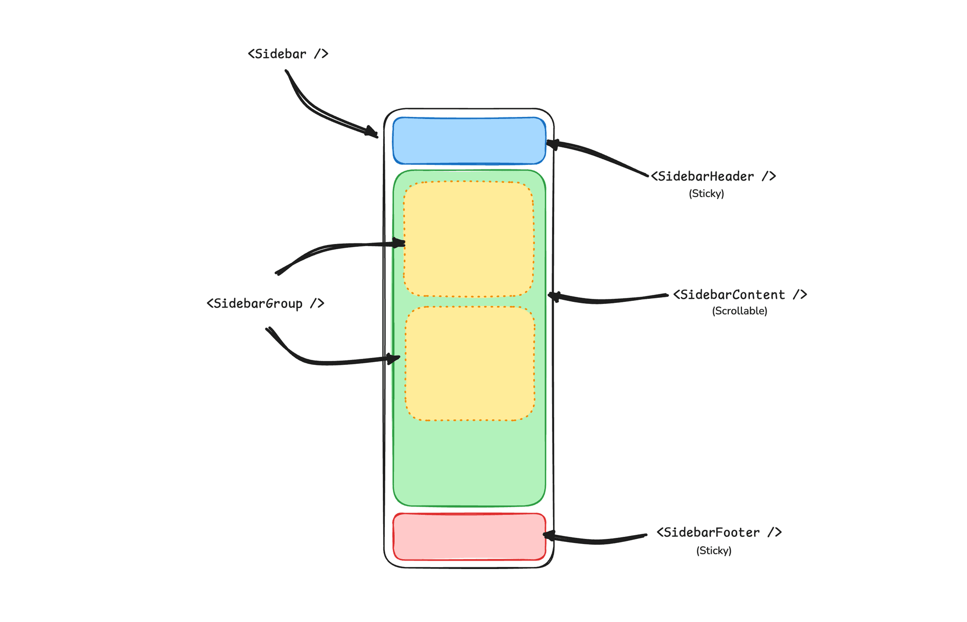
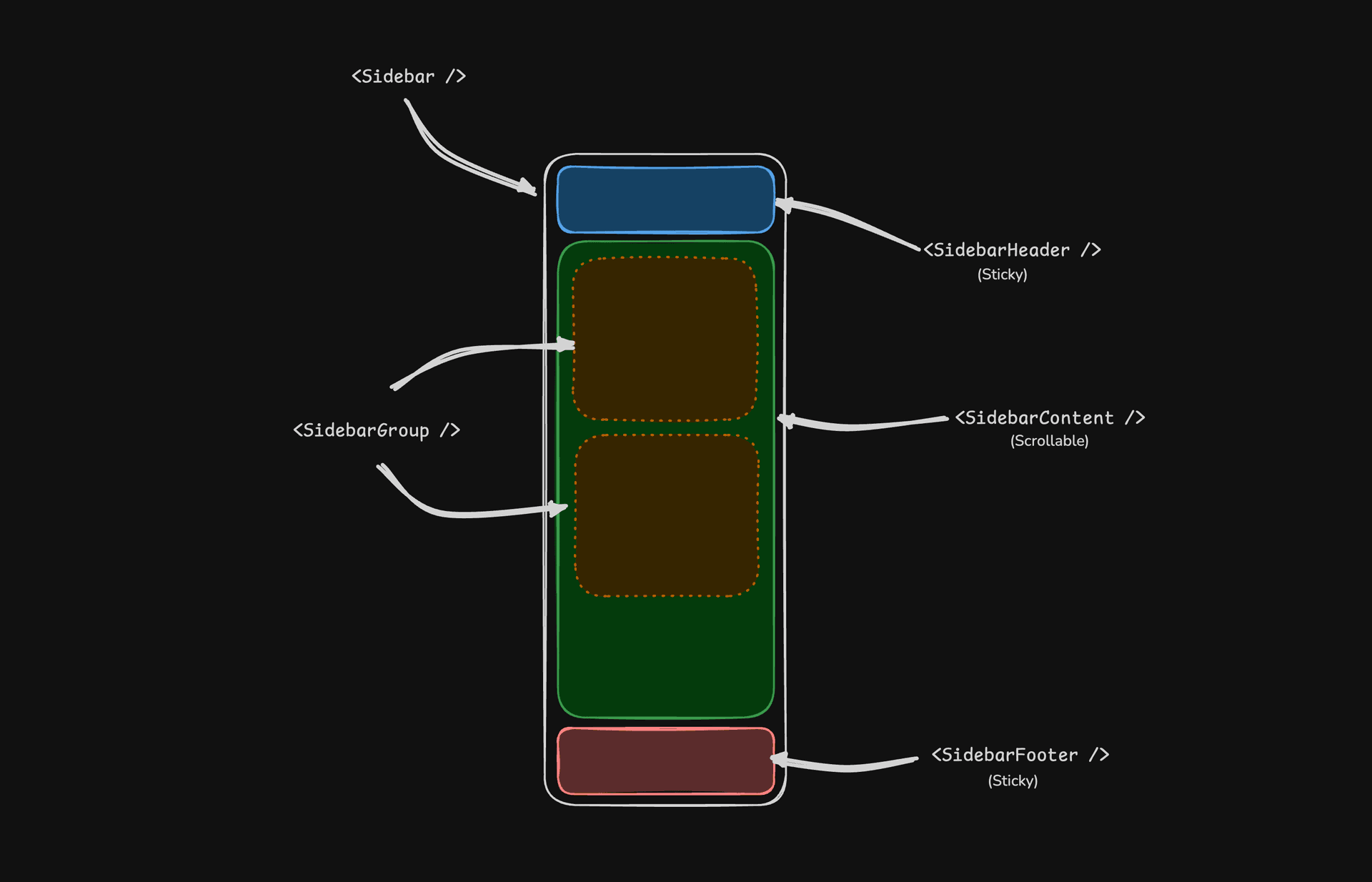
- SidebarProvider — 管理折叠状态,并向子组件提供侧边栏上下文。
- Sidebar — 主要的可折叠侧边栏面板。
- SidebarHeader — 固定在顶部;用于品牌标识、标题或工作区切换器。
- SidebarFooter — 固定在底部;用于用户菜单、设置或操作。
- SidebarContent — 位于页眉和页脚之间的可滚动区域。
- SidebarGroup — 将相关导航分组,包含可选的标签、操作和内容区域。
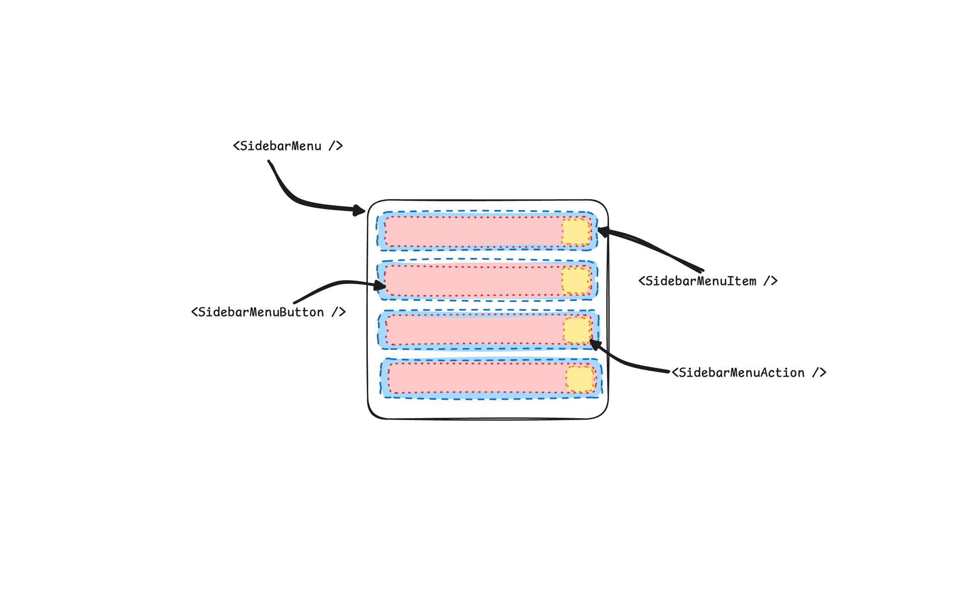
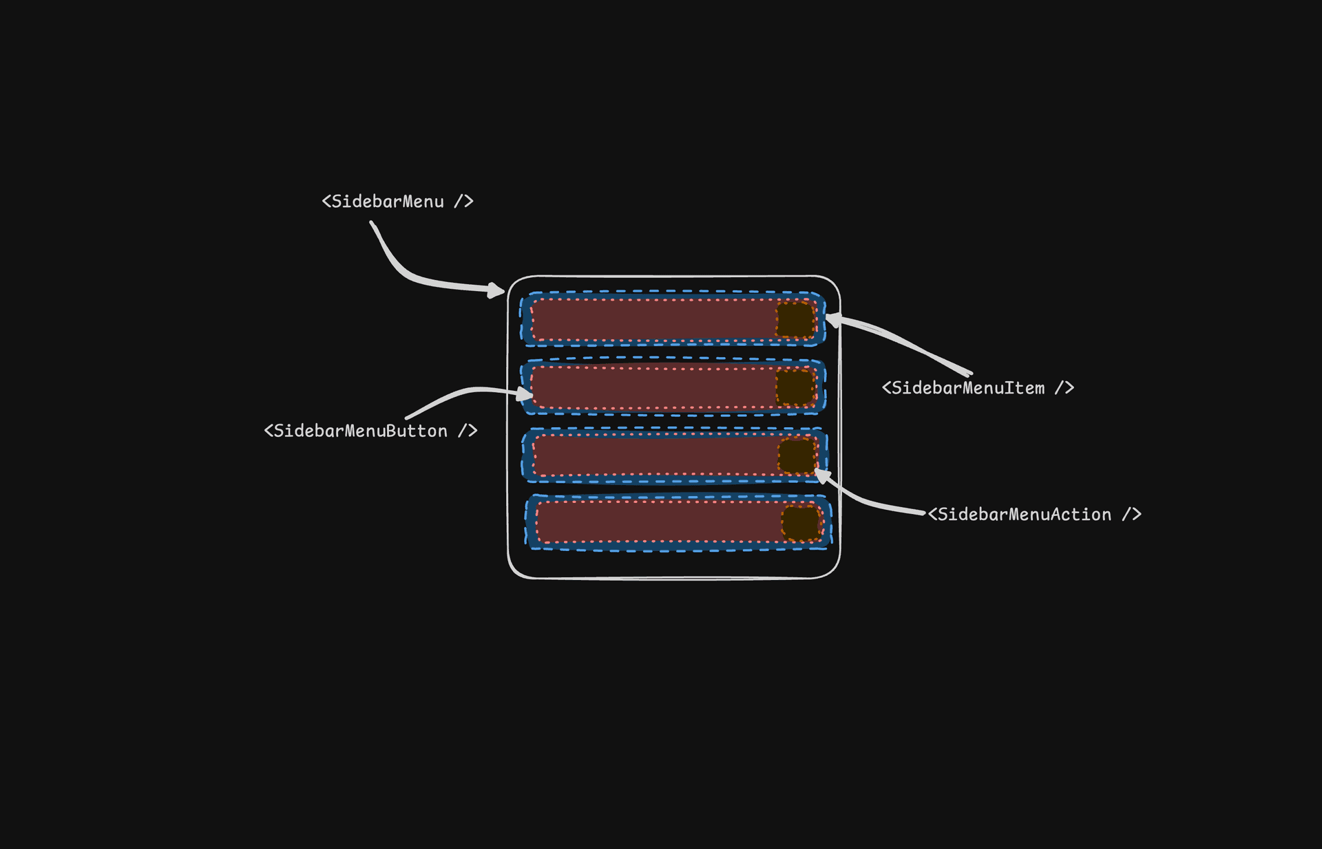
- SidebarMenu / SidebarMenuItem — 用于链接、徽章、操作和嵌套子菜单的菜单结构。
- SidebarRail — 在适用时用于调整侧边栏宽度的拖拽手柄。
- SidebarInset — 使用
inset变体时包裹主内容。 - SidebarTrigger — 用于切换侧边栏展开或折叠的控件。
SidebarProvider
SidebarProvider 组件用于向 Sidebar 组件提供侧边栏上下文。您应始终将应用包裹在 SidebarProvider 组件中。
属性
| 名称 | 类型 | 说明 |
|---|---|---|
defaultOpen | boolean | 侧边栏的默认展开状态。 |
open | boolean | 侧边栏的展开状态(受控)。 |
onOpenChange | (open: boolean) => void | 设置侧边栏的展开状态(受控)。 |
宽度
如果应用中只有一个侧边栏,可以使用 sidebar.tsx 中的 SIDEBAR_WIDTH 和 SIDEBAR_WIDTH_MOBILE 变量来设置侧边栏的宽度。
const SIDEBAR_WIDTH = "16rem"
const SIDEBAR_WIDTH_MOBILE = "18rem"如果应用中有多个侧边栏,可以在 style 属性中使用 --sidebar-width 和 --sidebar-width-mobile CSS 变量。
<SidebarProvider
style={
{
"--sidebar-width": "20rem",
"--sidebar-width-mobile": "20rem",
} as React.CSSProperties
}
>
<Sidebar />
</SidebarProvider>键盘快捷键
要触发侧边栏,在 Mac 上使用 cmd+b 键盘快捷键,在 Windows 上使用 ctrl+b。
const SIDEBAR_KEYBOARD_SHORTCUT = "b"Sidebar
用于渲染可折叠侧边栏的主要 Sidebar 组件。
属性
| 属性 | 类型 | 说明 |
|---|---|---|
side | left 或 right | 侧边栏所在的一侧。 |
variant | sidebar、floating 或 inset | 侧边栏的变体。 |
collapsible | offcanvas、icon 或 none | 侧边栏的折叠状态。 |
| 属性 | 说明 |
|---|---|
offcanvas | 从左侧或右侧滑入的可折叠侧边栏。 |
icon | 折叠为图标的侧边栏。 |
none | 不可折叠的侧边栏。 |
注意: 如果使用 inset 变体,请记得将主内容包裹在
SidebarInset 组件中。
<SidebarProvider>
<Sidebar variant="inset" />
<SidebarInset>
<main>{children}</main>
</SidebarInset>
</SidebarProvider>useSidebar
useSidebar 钩子用于控制侧边栏。
import { useSidebar } from "@/components/ui/sidebar"
export function AppSidebar() {
const {
state,
open,
setOpen,
openMobile,
setOpenMobile,
isMobile,
toggleSidebar,
} = useSidebar()
}| 属性 | 类型 | 说明 |
|---|---|---|
state | expanded 或 collapsed | 侧边栏的当前状态。 |
open | boolean | 侧边栏是否展开。 |
setOpen | (open: boolean) => void | 设置侧边栏的展开状态。 |
openMobile | boolean | 侧边栏在移动端是否展开。 |
setOpenMobile | (open: boolean) => void | 设置侧边栏在移动端的展开状态。 |
isMobile | boolean | 侧边栏是否处于移动端。 |
toggleSidebar | () => void | 切换侧边栏。桌面端和移动端均适用。 |
SidebarHeader
使用 SidebarHeader 组件为侧边栏添加固定页眉。
<Sidebar>
<SidebarHeader>
<SidebarMenu>
<SidebarMenuItem>
<DropdownMenu>
<DropdownMenuTrigger asChild>
<SidebarMenuButton>
Select Workspace
<ChevronDown className="ml-auto" />
</SidebarMenuButton>
</DropdownMenuTrigger>
<DropdownMenuContent className="w-[--radix-popper-anchor-width]">
<DropdownMenuItem>
<span>Acme Inc</span>
</DropdownMenuItem>
</DropdownMenuContent>
</DropdownMenu>
</SidebarMenuItem>
</SidebarMenu>
</SidebarHeader>
</Sidebar>SidebarFooter
使用 SidebarFooter 组件为侧边栏添加固定页脚。
<Sidebar>
<SidebarFooter>
<SidebarMenu>
<SidebarMenuItem>
<SidebarMenuButton>
<User2 /> Username
</SidebarMenuButton>
</SidebarMenuItem>
</SidebarMenu>
</SidebarFooter>
</Sidebar>SidebarContent
SidebarContent 组件用于包裹侧边栏的内容。您在这里添加 SidebarGroup 组件。它是可滚动的。
<Sidebar>
<SidebarContent>
<SidebarGroup />
<SidebarGroup />
</SidebarContent>
</Sidebar>SidebarGroup
使用 SidebarGroup 组件在侧边栏内创建一个区块。
一个 SidebarGroup 包含 SidebarGroupLabel、SidebarGroupContent 以及可选的 SidebarGroupAction。
<SidebarGroup>
<SidebarGroupLabel>Application</SidebarGroupLabel>
<SidebarGroupAction>
<Plus /> <span className="sr-only">Add Project</span>
</SidebarGroupAction>
<SidebarGroupContent></SidebarGroupContent>
</SidebarGroup>要使 SidebarGroup 可折叠,请将其包裹在 Collapsible 中。
<Collapsible defaultOpen className="group/collapsible">
<SidebarGroup>
<SidebarGroupLabel asChild>
<CollapsibleTrigger>
Help
<ChevronDown className="ml-auto transition-transform group-data-[state=open]/collapsible:rotate-180" />
</CollapsibleTrigger>
</SidebarGroupLabel>
<CollapsibleContent>
<SidebarGroupContent />
</CollapsibleContent>
</SidebarGroup>
</Collapsible>SidebarMenu
SidebarMenu 组件用于在 SidebarGroup 内构建菜单。
<SidebarMenu>
{projects.map((project) => (
<SidebarMenuItem key={project.name}>
<SidebarMenuButton asChild>
<a href={project.url}>
<project.icon />
<span>{project.name}</span>
</a>
</SidebarMenuButton>
</SidebarMenuItem>
))}
</SidebarMenu>SidebarMenuButton
SidebarMenuButton 组件用于在 SidebarMenuItem 内渲染菜单按钮。
默认情况下,SidebarMenuButton 会渲染一个按钮,但您可以使用 asChild 属性来渲染其他组件,例如 Link 或 a 标签。
使用 isActive 属性将菜单项标记为激活状态。
<SidebarMenuButton asChild isActive>
<a href="#">Home</a>
</SidebarMenuButton>SidebarMenuAction
SidebarMenuAction 组件用于在 SidebarMenuItem 内渲染菜单操作。
<SidebarMenuItem>
<SidebarMenuButton asChild>
<a href="#">
<Home />
<span>Home</span>
</a>
</SidebarMenuButton>
<SidebarMenuAction>
<Plus /> <span className="sr-only">Add Project</span>
</SidebarMenuAction>
</SidebarMenuItem>SidebarMenuSub
SidebarMenuSub 组件用于在 SidebarMenu 内渲染子菜单。
<SidebarMenuItem>
<SidebarMenuButton />
<SidebarMenuSub>
<SidebarMenuSubItem>
<SidebarMenuSubButton />
</SidebarMenuSubItem>
</SidebarMenuSub>
</SidebarMenuItem>SidebarMenuBadge
SidebarMenuBadge 组件用于在 SidebarMenuItem 内渲染徽章。
<SidebarMenuItem>
<SidebarMenuButton />
<SidebarMenuBadge>24</SidebarMenuBadge>
</SidebarMenuItem>SidebarMenuSkeleton
SidebarMenuSkeleton 组件用于为 SidebarMenu 渲染骨架屏。
<SidebarMenu>
{Array.from({ length: 5 }).map((_, index) => (
<SidebarMenuItem key={index}>
<SidebarMenuSkeleton />
</SidebarMenuItem>
))}
</SidebarMenu>SidebarTrigger
使用 SidebarTrigger 组件渲染一个切换侧边栏的按钮。
import { useSidebar } from "@/components/ui/sidebar"
export function CustomTrigger() {
const { toggleSidebar } = useSidebar()
return <button onClick={toggleSidebar}>Toggle Sidebar</button>
}SidebarRail
SidebarRail 组件用于在 Sidebar 内渲染一条导轨。这条导轨可用于切换侧边栏。
<Sidebar>
<SidebarHeader />
<SidebarContent>
<SidebarGroup />
</SidebarContent>
<SidebarFooter />
<SidebarRail />
</Sidebar>受控侧边栏
使用 open 和 onOpenChange 属性来控制侧边栏。
export function AppSidebar() {
const [open, setOpen] = React.useState(false)
return (
<SidebarProvider open={open} onOpenChange={setOpen}>
<Sidebar />
</SidebarProvider>
)
}主题设置
我们使用以下 CSS 变量来为侧边栏设置主题。
@layer base {
:root {
--sidebar-background: 0 0% 98%;
--sidebar-foreground: 240 5.3% 26.1%;
--sidebar-primary: 240 5.9% 10%;
--sidebar-primary-foreground: 0 0% 98%;
--sidebar-accent: 240 4.8% 95.9%;
--sidebar-accent-foreground: 240 5.9% 10%;
--sidebar-border: 220 13% 91%;
--sidebar-ring: 217.2 91.2% 59.8%;
}
.dark {
--sidebar-background: 240 5.9% 10%;
--sidebar-foreground: 240 4.8% 95.9%;
--sidebar-primary: 0 0% 98%;
--sidebar-primary-foreground: 240 5.9% 10%;
--sidebar-accent: 240 3.7% 15.9%;
--sidebar-accent-foreground: 240 4.8% 95.9%;
--sidebar-border: 240 3.7% 15.9%;
--sidebar-ring: 217.2 91.2% 59.8%;
}
}样式
下面是一些根据不同状态为侧边栏设置样式的技巧。
<Sidebar collapsible="icon">
<SidebarContent>
<SidebarGroup className="group-data-[collapsible=icon]:hidden" />
</SidebarContent>
</Sidebar><SidebarMenuItem>
<SidebarMenuButton />
<SidebarMenuAction className="peer-data-[active=true]/menu-button:opacity-100" />
</SidebarMenuItem>RTL
要在 Neobrutalism 中启用 RTL 支持,请参阅 RTL 配置指南。
更新日志
RTL 支持
如果您正在从旧版本的 Sidebar 组件升级,则需要应用以下更新以添加 RTL 支持:
为 Sidebar 组件添加 dir 属性。
将 dir 添加到解构的属性中,并将其传递给移动端的 SheetContent:
function Sidebar({
side = "left",
variant = "sidebar",
collapsible = "offcanvas",
className,
children,
+ dir,
...props
}: React.ComponentProps<"div"> & {
side?: "left" | "right"
variant?: "sidebar" | "floating" | "inset"
collapsible?: "offcanvas" | "icon" | "none"
}) {然后将其传递给移动视图中的 SheetContent:
<Sheet open={openMobile} onOpenChange={setOpenMobile} {...props}>
<SheetContent
+ dir={dir}
data-sidebar="sidebar"
data-slot="sidebar"
data-mobile="true"为侧边栏容器添加 data-side 属性。
在侧边栏容器元素上添加 data-side={side}:
<div
data-slot="sidebar-container"
+ data-side={side}
className={cn(更新侧边栏容器的定位类。
将 JavaScript 三元条件类替换为 CSS 数据属性选择器:
className={cn(
- "fixed inset-y-0 z-10 hidden h-svh w-(--sidebar-width) transition-[left,right,width] duration-200 ease-linear md:flex",
- side === "left"
- ? "left-0 group-data-[collapsible=offcanvas]:left-[calc(var(--sidebar-width)*-1)]"
- : "right-0 group-data-[collapsible=offcanvas]:right-[calc(var(--sidebar-width)*-1)]",
+ "fixed inset-y-0 z-10 hidden h-svh w-(--sidebar-width) transition-[left,right,width] duration-200 ease-linear md:flex data-[side=left]:left-0 data-[side=right]:right-0 data-[side=left]:group-data-[collapsible=offcanvas]:left-[calc(var(--sidebar-width)*-1)] data-[side=right]:group-data-[collapsible=offcanvas]:right-[calc(var(--sidebar-width)*-1)]",更新 SidebarRail 的定位类。
更新 SidebarRail 组件,为导轨使用物理定位:
className={cn(
- "hover:after:bg-sidebar-border absolute inset-y-0 z-20 hidden w-4 -translate-x-1/2 transition-all ease-linear group-data-[side=left]:-end-4 group-data-[side=right]:start-0 after:absolute after:inset-y-0 after:start-1/2 after:w-[2px] sm:flex",
+ "hover:after:bg-sidebar-border absolute inset-y-0 z-20 hidden w-4 ltr:-translate-x-1/2 rtl:-translate-x-1/2 transition-all ease-linear group-data-[side=left]:-right-4 group-data-[side=right]:left-0 after:absolute after:inset-y-0 after:start-1/2 after:w-[2px] sm:flex",为 SidebarTrigger 的图标添加 RTL 翻转。
为 SidebarTrigger 中的图标添加 className="rtl:rotate-180",使其在 RTL 模式下翻转:
<Button ...>
- <PanelLeftIcon />
+ <PanelLeftIcon className="rtl:rotate-180" />
<span className="sr-only">Toggle Sidebar</span>
</Button>应用这些更改后,您就可以使用 dir 属性来设置方向:
<Sidebar dir="rtl" side="right">
{/* ... */}
</Sidebar>侧边栏将在 LTR 和 RTL 两种布局中都正确定位并处理交互。
无障碍
应用侧边栏没有单一对应的 WAI-ARIA 模式——这里的菜单就是一批普通的按钮和链接,靠 Tab 来遍历,而不是 ARIA 菜单,因此不涉及方向键轮转。在移动端,侧边栏渲染在 Sheet 内部,也就是符合 WAI-ARIA Dialog (Modal) 模式 的模态对话框:焦点被锁定,Escape 可以关闭它,视觉隐藏的标题和描述则负责向屏幕阅读器说明它的身份。SidebarTrigger 自带 aria-label="Toggle Sidebar";而 SidebarGroupAction、SidebarMenuAction 这类纯图标控件需要各自的 sr-only 标签——上面的示例里都已经加好了。
键盘交互:
| 按键 | 操作 |
|---|---|
Cmd + B / Ctrl + B | 切换侧边栏(可通过 SIDEBAR_KEYBOARD_SHORTCUT 修改) |
Tab / Shift + Tab | 在触发器、菜单按钮和操作按钮之间移动焦点 |
Enter / Space | 激活当前聚焦的菜单按钮或操作按钮 |
Escape | 关闭移动端侧边栏(模态 Sheet) |