
Kenar çubuğu
Kontrol panelleri, belgeler ve yönetim araçları için katlanabilir bir uygulama kabuğu gezinme paneli — neobrütalist kenarlık ve gölge efektleriyle.
Kenar çubukları, oluşturulması en karmaşık bileşenlerden biridir. Her uygulamanın merkezinde yer alır ve genellikle çok sayıda hareketli parça içerir.
Artık üzerine inşa edebileceğimiz sağlam bir temele sahibiz. Birleştirilebilir. Temalandırılabilir. Özelleştirilebilir.
Kurulum
"use client"

import * as React from "react"
import { cva, type VariantProps } from "class-variance-authority"
import { PanelLeftIcon } from "lucide-react"
import { Slot } from "radix-ui"
import { cn } from "@/lib/utils"
import { useIsMobile } from "@/hooks/use-mobile"
import { Button } from "@/components/ui/button"
import { Input } from "@/components/ui/input"
import { Separator } from "@/components/ui/separator"
import {
Sheet,
SheetContent,
SheetDescription,
SheetHeader,
SheetTitle,
} from "@/components/ui/sheet"
import { Skeleton } from "@/components/ui/skeleton"
import {
Tooltip,
TooltipContent,
TooltipProvider,
TooltipTrigger,
} from "@/components/ui/tooltip"
const SIDEBAR_COOKIE_NAME = "sidebar_state"
const SIDEBAR_COOKIE_MAX_AGE = 60 * 60 * 24 * 7
const SIDEBAR_WIDTH = "16rem"
const SIDEBAR_WIDTH_MOBILE = "18rem"
const SIDEBAR_WIDTH_ICON = "3rem"
const SIDEBAR_KEYBOARD_SHORTCUT = "b"
type SidebarContextProps = {
state: "expanded" | "collapsed"
open: boolean
setOpen: (open: boolean) => void
openMobile: boolean
setOpenMobile: (open: boolean) => void
isMobile: boolean
toggleSidebar: () => void
}
const SidebarContext = React.createContext<SidebarContextProps | null>(null)
function useSidebar() {
const context = React.useContext(SidebarContext)
if (!context) {
throw new Error("useSidebar must be used within a SidebarProvider.")
}
return context
}
function SidebarProvider({
defaultOpen = true,
open: openProp,
onOpenChange: setOpenProp,
className,
style,
children,
...props
}: React.ComponentProps<"div"> & {
defaultOpen?: boolean
open?: boolean
onOpenChange?: (open: boolean) => void
}) {
const isMobile = useIsMobile()
const [openMobile, setOpenMobile] = React.useState(false)
// This is the internal state of the sidebar.
// We use openProp and setOpenProp for control from outside the component.
const [_open, _setOpen] = React.useState(defaultOpen)
const open = openProp ?? _open
const setOpen = React.useCallback(
(value: boolean | ((value: boolean) => boolean)) => {
const openState = typeof value === "function" ? value(open) : value
if (setOpenProp) {
setOpenProp(openState)
} else {
_setOpen(openState)
}
// This sets the cookie to keep the sidebar state.
document.cookie = `${SIDEBAR_COOKIE_NAME}=${openState}; path=/; max-age=${SIDEBAR_COOKIE_MAX_AGE}`
},
[setOpenProp, open]
)
// Helper to toggle the sidebar.
const toggleSidebar = React.useCallback(() => {
return isMobile ? setOpenMobile((open) => !open) : setOpen((open) => !open)
}, [isMobile, setOpen, setOpenMobile])
// Adds a keyboard shortcut to toggle the sidebar.
React.useEffect(() => {
const handleKeyDown = (event: KeyboardEvent) => {
if (
event.key === SIDEBAR_KEYBOARD_SHORTCUT &&
(event.metaKey || event.ctrlKey)
) {
event.preventDefault()
toggleSidebar()
}
}
window.addEventListener("keydown", handleKeyDown)
return () => window.removeEventListener("keydown", handleKeyDown)
}, [toggleSidebar])
// We add a state so that we can do data-state="expanded" or "collapsed".
// This makes it easier to style the sidebar with Tailwind classes.
const state = open ? "expanded" : "collapsed"
const contextValue = React.useMemo<SidebarContextProps>(
() => ({
state,
open,
setOpen,
isMobile,
openMobile,
setOpenMobile,
toggleSidebar,
}),
[state, open, setOpen, isMobile, openMobile, setOpenMobile, toggleSidebar]
)
return (
<SidebarContext.Provider value={contextValue}>
<TooltipProvider delayDuration={0}>
<div
data-slot="sidebar-wrapper"
style={
{
"--sidebar-width": SIDEBAR_WIDTH,
"--sidebar-width-icon": SIDEBAR_WIDTH_ICON,
...style,
} as React.CSSProperties
}
className={cn(
"group/sidebar-wrapper flex min-h-svh w-full has-data-[variant=inset]:bg-sidebar",
className
)}
{...props}
>
{children}
</div>
</TooltipProvider>
</SidebarContext.Provider>
)
}
function Sidebar({
side = "left",
variant = "sidebar",
collapsible = "offcanvas",
className,
children,
dir,
...props
}: React.ComponentProps<"div"> & {
side?: "left" | "right"
variant?: "sidebar" | "floating" | "inset"
collapsible?: "offcanvas" | "icon" | "none"
}) {
const { isMobile, state, openMobile, setOpenMobile } = useSidebar()
if (collapsible === "none") {
return (
<div
data-slot="sidebar"
className={cn(
"flex h-full w-(--sidebar-width) flex-col bg-sidebar text-sidebar-foreground",
className
)}
{...props}
>
{children}
</div>
)
}
if (isMobile) {
return (
<Sheet open={openMobile} onOpenChange={setOpenMobile} {...props}>
<SheetContent
dir={dir}
data-sidebar="sidebar"
data-slot="sidebar"
data-mobile="true"
className="w-(--sidebar-width) bg-sidebar p-0 text-sidebar-foreground [&>button]:hidden"
style={
{
"--sidebar-width": SIDEBAR_WIDTH_MOBILE,
} as React.CSSProperties
}
side={side}
>
<SheetHeader className="sr-only">
<SheetTitle>Sidebar</SheetTitle>
<SheetDescription>Displays the mobile sidebar.</SheetDescription>
</SheetHeader>
<div className="flex h-full w-full flex-col">{children}</div>
</SheetContent>
</Sheet>
)
}
return (
<div
className="group peer hidden text-sidebar-foreground md:block"
data-state={state}
data-collapsible={state === "collapsed" ? collapsible : ""}
data-variant={variant}
data-side={side}
data-slot="sidebar"
>
{/* This is what handles the sidebar gap on desktop */}
<div
data-slot="sidebar-gap"
className={cn(
"relative w-(--sidebar-width) bg-transparent transition-[width] duration-200 ease-linear",
"group-data-[collapsible=offcanvas]:w-0",
"group-data-[side=right]:rotate-180",
variant === "floating" || variant === "inset"
? "group-data-[collapsible=icon]:w-[calc(var(--sidebar-width-icon)+(--spacing(4)))]"
: "group-data-[collapsible=icon]:w-(--sidebar-width-icon)"
)}
/>
<div
data-slot="sidebar-container"
data-side={side}
className={cn(
"fixed inset-y-0 z-10 hidden h-svh w-(--sidebar-width) transition-[left,right,width] duration-200 ease-linear data-[side=left]:left-0 data-[side=left]:group-data-[collapsible=offcanvas]:left-[calc(var(--sidebar-width)*-1)] data-[side=right]:right-0 data-[side=right]:group-data-[collapsible=offcanvas]:right-[calc(var(--sidebar-width)*-1)] md:flex",
// Adjust the padding for floating and inset variants.
variant === "floating" || variant === "inset"
? "p-2 group-data-[collapsible=icon]:w-[calc(var(--sidebar-width-icon)+(--spacing(4))+2px)]"
: "group-data-[collapsible=icon]:w-(--sidebar-width-icon) group-data-[side=left]:border-r-2 group-data-[side=right]:border-l-2",
className
)}
{...props}
>
<div
data-sidebar="sidebar"
data-slot="sidebar-inner"
className="flex size-full flex-col bg-sidebar group-data-[variant=floating]:rounded-lg group-data-[variant=floating]:border-2 group-data-[variant=floating]:border-sidebar-border group-data-[variant=floating]:shadow-md"
>
{children}
</div>
</div>
</div>
)
}
function SidebarTrigger({
className,
onClick,
...props
}: React.ComponentProps<typeof Button>) {
const { toggleSidebar } = useSidebar()
return (
<Button
data-sidebar="trigger"
data-slot="sidebar-trigger"
variant="ghost"
size="icon-sm"
className={cn(className)}
onClick={(event) => {
onClick?.(event)
toggleSidebar()
}}
{...props}
>
<PanelLeftIcon className="cn-rtl-flip" />
<span className="sr-only">Toggle Sidebar</span>
</Button>
)
}
function SidebarRail({ className, ...props }: React.ComponentProps<"button">) {
const { toggleSidebar } = useSidebar()
return (
<button
data-sidebar="rail"
data-slot="sidebar-rail"
aria-label="Toggle Sidebar"
tabIndex={-1}
onClick={toggleSidebar}
title="Toggle Sidebar"
className={cn(
"absolute inset-y-0 z-20 hidden w-4 transition-all ease-linear group-data-[side=left]:-right-4 group-data-[side=right]:left-0 after:absolute after:inset-y-0 after:start-1/2 after:w-[2px] hover:after:bg-sidebar-border sm:flex ltr:-translate-x-1/2 rtl:-translate-x-1/2",
"in-data-[side=left]:cursor-w-resize in-data-[side=right]:cursor-e-resize",
"[[data-side=left][data-state=collapsed]_&]:cursor-e-resize [[data-side=right][data-state=collapsed]_&]:cursor-w-resize",
"group-data-[collapsible=offcanvas]:translate-x-0 group-data-[collapsible=offcanvas]:after:left-full hover:group-data-[collapsible=offcanvas]:bg-sidebar",
"[[data-side=left][data-collapsible=offcanvas]_&]:-right-2",
"[[data-side=right][data-collapsible=offcanvas]_&]:-left-2",
className
)}
{...props}
/>
)
}
function SidebarInset({ className, ...props }: React.ComponentProps<"main">) {
return (
<main
data-slot="sidebar-inset"
className={cn(
"relative flex w-full flex-1 flex-col bg-background md:peer-data-[variant=inset]:m-2 md:peer-data-[variant=inset]:ml-0 md:peer-data-[variant=inset]:rounded-xl md:peer-data-[variant=inset]:border-2 md:peer-data-[variant=inset]:border-border md:peer-data-[variant=inset]:shadow-md md:peer-data-[variant=inset]:peer-data-[state=collapsed]:ml-2",
className
)}
{...props}
/>
)
}
function SidebarInput({
className,
...props
}: React.ComponentProps<typeof Input>) {
return (
<Input
data-slot="sidebar-input"
data-sidebar="input"
className={cn("h-8 w-full bg-background shadow-none", className)}
{...props}
/>
)
}
function SidebarHeader({ className, ...props }: React.ComponentProps<"div">) {
return (
<div
data-slot="sidebar-header"
data-sidebar="header"
className={cn("flex flex-col gap-2 p-2", className)}
{...props}
/>
)
}
function SidebarFooter({ className, ...props }: React.ComponentProps<"div">) {
return (
<div
data-slot="sidebar-footer"
data-sidebar="footer"
className={cn("flex flex-col gap-2 p-2", className)}
{...props}
/>
)
}
function SidebarSeparator({
className,
...props
}: React.ComponentProps<typeof Separator>) {
return (
<Separator
data-slot="sidebar-separator"
data-sidebar="separator"
className={cn("mx-2 w-auto bg-sidebar-border", className)}
{...props}
/>
)
}
function SidebarContent({ className, ...props }: React.ComponentProps<"div">) {
return (
<div
data-slot="sidebar-content"
data-sidebar="content"
className={cn(
"no-scrollbar flex min-h-0 flex-1 flex-col gap-0 overflow-auto group-data-[collapsible=icon]:overflow-hidden",
className
)}
{...props}
/>
)
}
function SidebarGroup({ className, ...props }: React.ComponentProps<"div">) {
return (
<div
data-slot="sidebar-group"
data-sidebar="group"
className={cn("relative flex w-full min-w-0 flex-col p-2", className)}
{...props}
/>
)
}
function SidebarGroupLabel({
className,
asChild = false,
...props
}: React.ComponentProps<"div"> & { asChild?: boolean }) {
const Comp = asChild ? Slot.Root : "div"
return (
<Comp
data-slot="sidebar-group-label"
data-sidebar="group-label"
className={cn(
"flex h-8 shrink-0 items-center rounded px-2 font-head text-xs font-semibold tracking-wider text-sidebar-foreground/70 uppercase ring-sidebar-ring outline-hidden transition-[margin,opacity] duration-200 ease-linear group-data-[collapsible=icon]:-mt-8 group-data-[collapsible=icon]:opacity-0 focus-visible:ring-2 [&>svg]:size-4 [&>svg]:shrink-0",
className
)}
{...props}
/>
)
}
function SidebarGroupAction({
className,
asChild = false,
...props
}: React.ComponentProps<"button"> & { asChild?: boolean }) {
const Comp = asChild ? Slot.Root : "button"
return (
<Comp
data-slot="sidebar-group-action"
data-sidebar="group-action"
className={cn(
"absolute top-3.5 right-3 flex aspect-square w-5 items-center justify-center rounded border-2 border-transparent p-0 text-sidebar-foreground ring-sidebar-ring outline-hidden transition-transform group-data-[collapsible=icon]:hidden after:absolute after:-inset-2 hover:bg-accent hover:text-accent-foreground focus-visible:ring-2 md:after:hidden [&>svg]:size-4 [&>svg]:shrink-0",
className
)}
{...props}
/>
)
}
function SidebarGroupContent({
className,
...props
}: React.ComponentProps<"div">) {
return (
<div
data-slot="sidebar-group-content"
data-sidebar="group-content"
className={cn("w-full text-sm", className)}
{...props}
/>
)
}
function SidebarMenu({ className, ...props }: React.ComponentProps<"ul">) {
return (
<ul
data-slot="sidebar-menu"
data-sidebar="menu"
className={cn("flex w-full min-w-0 flex-col gap-0", className)}
{...props}
/>
)
}
function SidebarMenuItem({ className, ...props }: React.ComponentProps<"li">) {
return (
<li
data-slot="sidebar-menu-item"
data-sidebar="menu-item"
className={cn("group/menu-item relative", className)}
{...props}
/>
)
}
const sidebarMenuButtonVariants = cva(
"peer/menu-button group/menu-button flex w-full items-center gap-2 overflow-hidden rounded border-2 border-transparent p-2 text-left font-head text-sm ring-sidebar-ring outline-hidden transition-[width,height,padding] group-has-data-[sidebar=menu-action]/menu-item:pr-8 group-data-[collapsible=icon]:size-8! group-data-[collapsible=icon]:p-2! hover:bg-accent hover:text-accent-foreground focus-visible:ring-2 active:bg-accent active:text-accent-foreground disabled:pointer-events-none disabled:opacity-50 aria-disabled:pointer-events-none aria-disabled:opacity-50 data-open:hover:bg-accent data-open:hover:text-accent-foreground data-active:border-border data-active:bg-primary data-active:font-medium data-active:text-primary-foreground data-active:shadow-md [&_svg]:size-4 [&_svg]:shrink-0 [&>span:last-child]:truncate",
{
variants: {
variant: {
default: "hover:bg-accent hover:text-accent-foreground",
outline:
"border-border bg-background shadow-md hover:bg-accent hover:text-accent-foreground hover:shadow-lg",
},
size: {
default: "h-8 text-sm",
sm: "h-7 text-xs",
lg: "h-12 text-sm group-data-[collapsible=icon]:p-0!",
},
},
defaultVariants: {
variant: "default",
size: "default",
},
}
)
function SidebarMenuButton({
asChild = false,
isActive = false,
variant = "default",
size = "default",
tooltip,
className,
...props
}: React.ComponentProps<"button"> & {
asChild?: boolean
isActive?: boolean
tooltip?: string | React.ComponentProps<typeof TooltipContent>
} & VariantProps<typeof sidebarMenuButtonVariants>) {
const Comp = asChild ? Slot.Root : "button"
const { isMobile, state } = useSidebar()
const button = (
<Comp
data-slot="sidebar-menu-button"
data-sidebar="menu-button"
data-size={size}
data-active={isActive}
className={cn(sidebarMenuButtonVariants({ variant, size }), className)}
{...props}
/>
)
if (!tooltip) {
return button
}
if (typeof tooltip === "string") {
tooltip = {
children: tooltip,
}
}
return (
<Tooltip>
<TooltipTrigger asChild>{button}</TooltipTrigger>
<TooltipContent
side="right"
align="center"
hidden={state !== "collapsed" || isMobile}
{...tooltip}
/>
</Tooltip>
)
}
function SidebarMenuAction({
className,
asChild = false,
showOnHover = false,
...props
}: React.ComponentProps<"button"> & {
asChild?: boolean
showOnHover?: boolean
}) {
const Comp = asChild ? Slot.Root : "button"
return (
<Comp
data-slot="sidebar-menu-action"
data-sidebar="menu-action"
className={cn(
"absolute top-1.5 right-1 flex aspect-square w-5 items-center justify-center rounded border-2 border-transparent p-0 text-sidebar-foreground ring-sidebar-ring outline-hidden transition-transform group-data-[collapsible=icon]:hidden peer-hover/menu-button:text-sidebar-accent-foreground peer-data-[size=default]/menu-button:top-1.5 peer-data-[size=lg]/menu-button:top-2.5 peer-data-[size=sm]/menu-button:top-1 after:absolute after:-inset-2 hover:bg-accent hover:text-accent-foreground focus-visible:ring-2 md:after:hidden [&>svg]:size-4 [&>svg]:shrink-0",
showOnHover &&
"group-focus-within/menu-item:opacity-100 group-hover/menu-item:opacity-100 peer-data-active/menu-button:text-sidebar-accent-foreground aria-expanded:opacity-100 md:opacity-0",
className
)}
{...props}
/>
)
}
function SidebarMenuBadge({
className,
...props
}: React.ComponentProps<"div">) {
return (
<div
data-slot="sidebar-menu-badge"
data-sidebar="menu-badge"
className={cn(
"pointer-events-none absolute right-1 flex h-5 min-w-5 items-center justify-center rounded border-2 border-border px-1 font-head text-xs font-medium text-sidebar-foreground tabular-nums select-none group-data-[collapsible=icon]:hidden peer-hover/menu-button:text-sidebar-accent-foreground peer-data-[size=default]/menu-button:top-1.5 peer-data-[size=lg]/menu-button:top-2.5 peer-data-[size=sm]/menu-button:top-1 peer-data-active/menu-button:text-sidebar-accent-foreground",
className
)}
{...props}
/>
)
}
function SidebarMenuSkeleton({
className,
showIcon = false,
...props
}: React.ComponentProps<"div"> & {
showIcon?: boolean
}) {
// Random width between 50 to 90%.
const [width] = React.useState(() => {
return `${Math.floor(Math.random() * 40) + 50}%`
})
return (
<div
data-slot="sidebar-menu-skeleton"
data-sidebar="menu-skeleton"
className={cn("flex h-8 items-center gap-2 rounded-md px-2", className)}
{...props}
>
{showIcon && (
<Skeleton
className="size-4 rounded-md"
data-sidebar="menu-skeleton-icon"
/>
)}
<Skeleton
className="h-4 max-w-(--skeleton-width) flex-1"
data-sidebar="menu-skeleton-text"
style={
{
"--skeleton-width": width,
} as React.CSSProperties
}
/>
</div>
)
}
function SidebarMenuSub({ className, ...props }: React.ComponentProps<"ul">) {
return (
<ul
data-slot="sidebar-menu-sub"
data-sidebar="menu-sub"
className={cn(
"mx-3.5 flex min-w-0 translate-x-px flex-col gap-1 border-l border-sidebar-border px-2.5 py-0.5 group-data-[collapsible=icon]:hidden",
className
)}
{...props}
/>
)
}
function SidebarMenuSubItem({
className,
...props
}: React.ComponentProps<"li">) {
return (
<li
data-slot="sidebar-menu-sub-item"
data-sidebar="menu-sub-item"
className={cn("group/menu-sub-item relative", className)}
{...props}
/>
)
}
function SidebarMenuSubButton({
asChild = false,
size = "md",
isActive = false,
className,
...props
}: React.ComponentProps<"a"> & {
asChild?: boolean
size?: "sm" | "md"
isActive?: boolean
}) {
const Comp = asChild ? Slot.Root : "a"
return (
<Comp
data-slot="sidebar-menu-sub-button"
data-sidebar="menu-sub-button"
data-size={size}
data-active={isActive}
className={cn(
"flex h-7 min-w-0 -translate-x-px items-center gap-2 overflow-hidden rounded border-2 border-transparent px-2 font-head text-sidebar-foreground ring-sidebar-ring outline-hidden group-data-[collapsible=icon]:hidden hover:bg-accent hover:text-accent-foreground focus-visible:ring-2 active:bg-accent active:text-accent-foreground disabled:pointer-events-none disabled:opacity-50 aria-disabled:pointer-events-none aria-disabled:opacity-50 data-[size=md]:text-sm data-[size=sm]:text-xs data-active:border-border data-active:bg-primary data-active:text-primary-foreground data-active:shadow-md [&>span:last-child]:truncate [&>svg]:size-4 [&>svg]:shrink-0 [&>svg]:text-sidebar-accent-foreground",
className
)}
{...props}
/>
)
}
export {
Sidebar,
SidebarContent,
SidebarFooter,
SidebarGroup,
SidebarGroupAction,
SidebarGroupContent,
SidebarGroupLabel,
SidebarHeader,
SidebarInput,
SidebarInset,
SidebarMenu,
SidebarMenuAction,
SidebarMenuBadge,
SidebarMenuButton,
SidebarMenuItem,
SidebarMenuSkeleton,
SidebarMenuSub,
SidebarMenuSubButton,
SidebarMenuSubItem,
SidebarProvider,
SidebarRail,
SidebarSeparator,
SidebarTrigger,
useSidebar,
}
Kullanım
import { SidebarProvider, SidebarTrigger } from "@/components/ui/sidebar"
import { AppSidebar } from "@/components/app-sidebar"
export default function Layout({ children }: { children: React.ReactNode }) {
return (
<SidebarProvider>
<AppSidebar />
<main>
<SidebarTrigger />
{children}
</main>
</SidebarProvider>
)
}import {
Sidebar,
SidebarContent,
SidebarFooter,
SidebarGroup,
SidebarHeader,
} from "@/components/ui/sidebar"
export function AppSidebar() {
return (
<Sidebar>
<SidebarHeader />
<SidebarContent>
<SidebarGroup />
<SidebarGroup />
</SidebarContent>
<SidebarFooter />
</Sidebar>
)
}Kompozisyon
Bir Sidebar düzeni oluşturmak için aşağıdaki kompozisyonu kullanın:
SidebarProvider
├── Sidebar
│ ├── SidebarHeader
│ ├── SidebarContent
│ │ ├── SidebarGroup
│ │ │ ├── SidebarGroupLabel
│ │ │ ├── SidebarGroupAction
│ │ │ ├── SidebarGroupContent
│ │ │ └── SidebarMenu
│ │ │ ├── SidebarMenuItem
│ │ │ │ ├── SidebarMenuButton
│ │ │ │ ├── SidebarMenuAction
│ │ │ │ └── SidebarMenuBadge
│ │ │ └── SidebarMenuItem
│ │ │ ├── SidebarMenuButton
│ │ │ └── SidebarMenuSub
│ │ │ ├── SidebarMenuSubItem
│ │ │ └── SidebarMenuSubItem
│ │ └── SidebarGroup
│ │ └── SidebarMenu
│ │ ├── SidebarMenuItem
│ │ └── SidebarMenuItem
│ ├── SidebarFooter
│ └── SidebarRail
├── SidebarInset
└── SidebarTriggerYapı
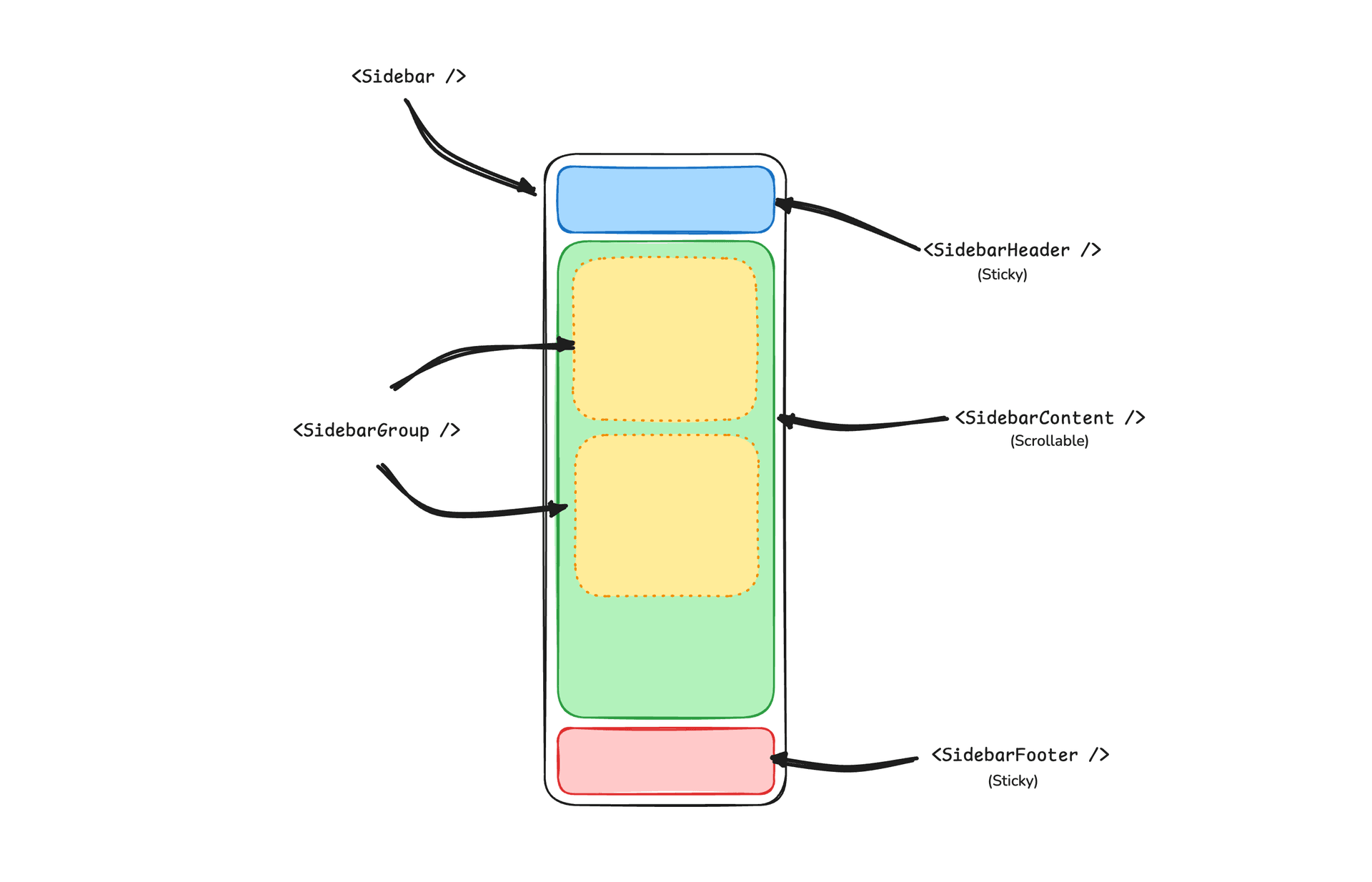
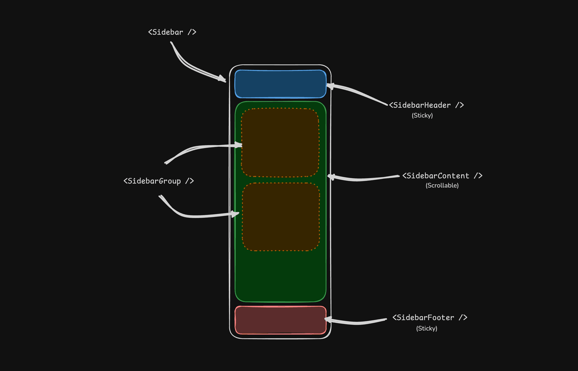
- SidebarProvider — Daraltma durumunu yönetir ve alt bileşenlere kenar çubuğu bağlamını sağlar.
- Sidebar — Ana daraltılabilir kenar çubuğu paneli.
- SidebarHeader — Üstte sabit kalır; markalama, başlıklar veya çalışma alanı değiştiriciler için kullanın.
- SidebarFooter — Altta sabit kalır; kullanıcı menüleri, ayarlar veya eylemler için kullanın.
- SidebarContent — Üstbilgi ve altbilgi arasındaki kaydırılabilir bölge.
- SidebarGroup — İlgili gezinmeyi isteğe bağlı etiket, eylem ve içerik alanlarıyla gruplar.
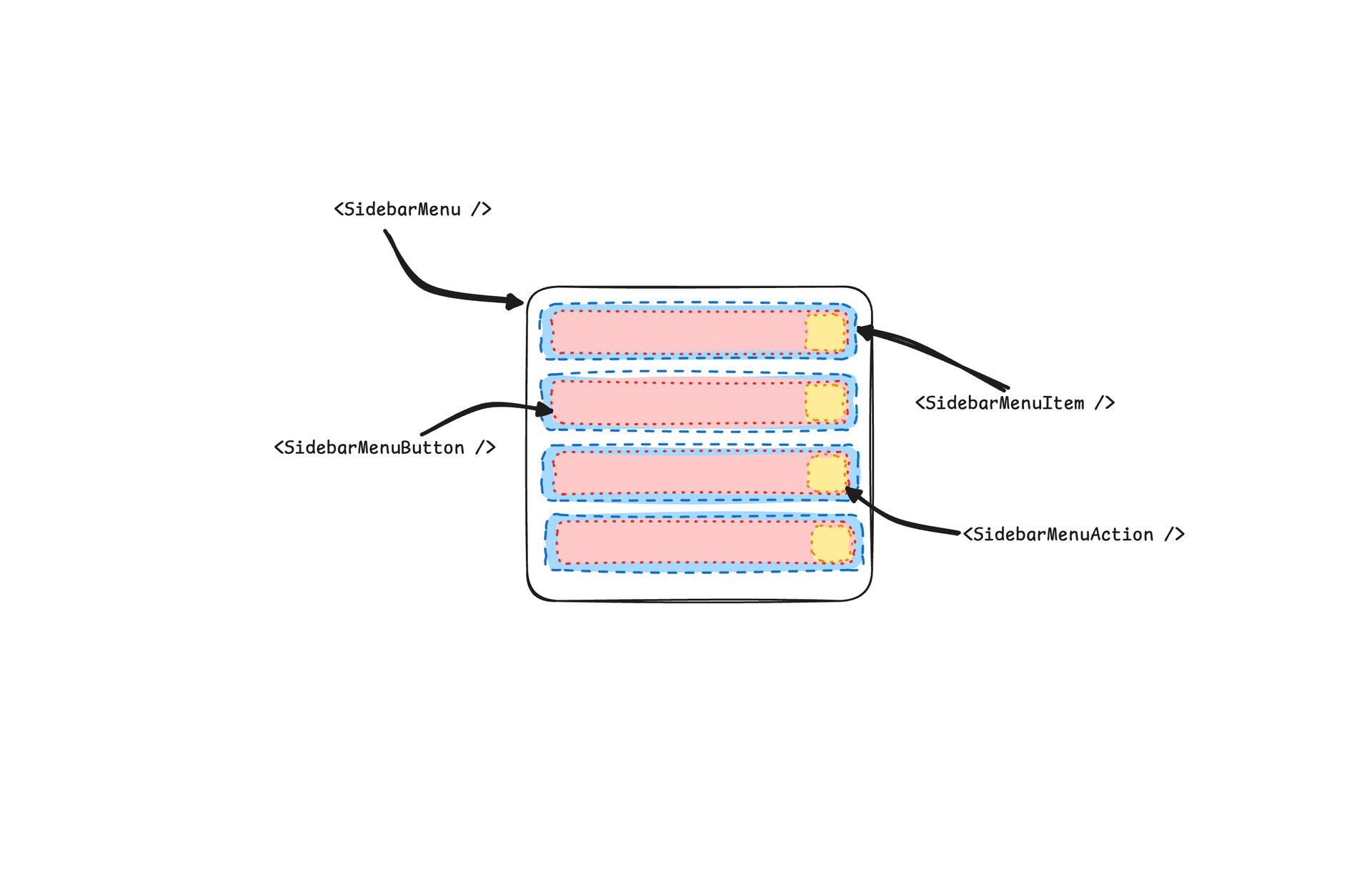
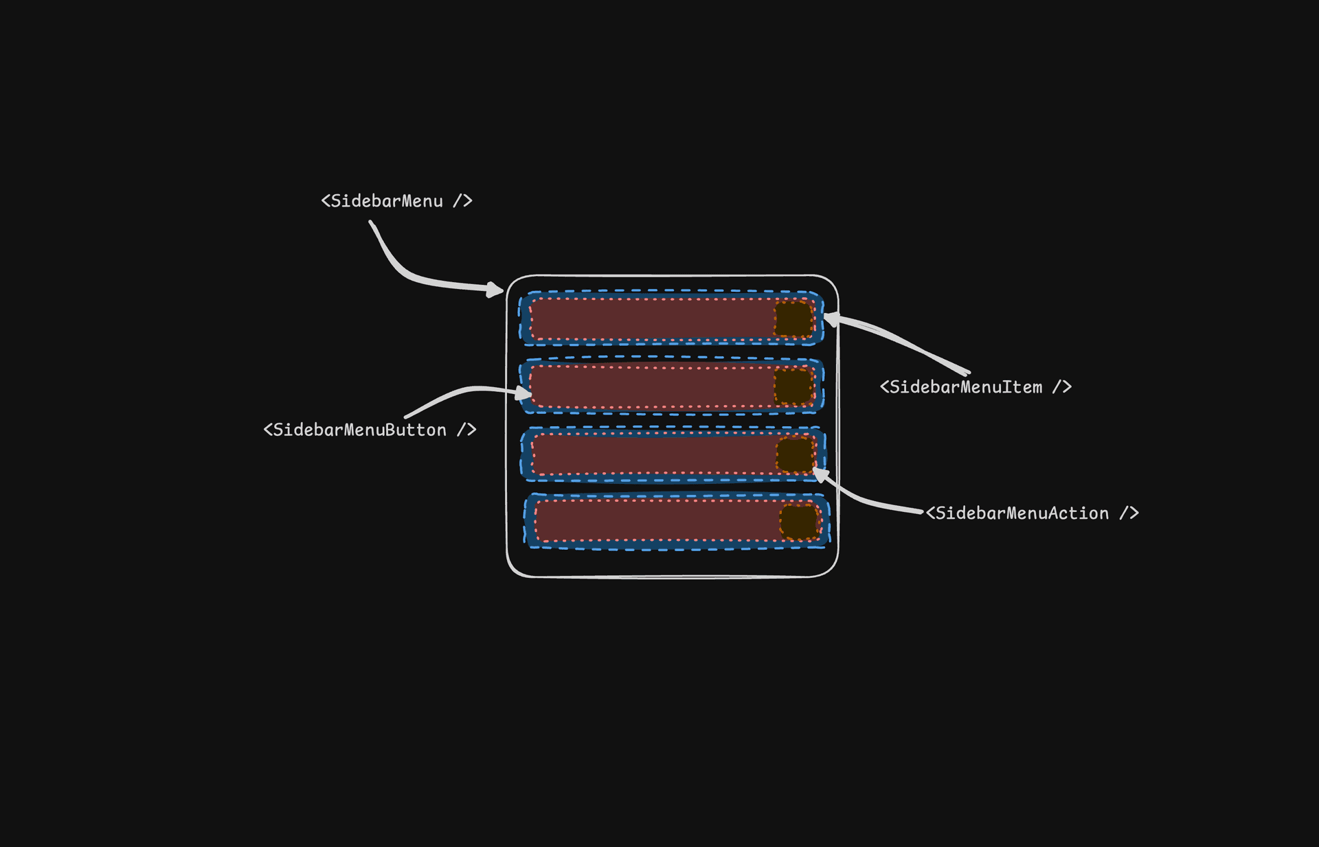
- SidebarMenu / SidebarMenuItem — Bağlantılar, rozetler, eylemler ve iç içe alt menüler için menü yapısı.
- SidebarRail — Uygun olduğunda kenar çubuğu genişliğini ayarlamak için yeniden boyutlandırma tutamacı.
- SidebarInset —
insetvaryantını kullanırken ana içeriği sarar. - SidebarTrigger — Kenar çubuğunu açık veya daraltılmış duruma geçiren kontrol.
SidebarProvider
SidebarProvider bileşeni, Sidebar bileşenine kenar çubuğu bağlamını sağlamak için kullanılır. Uygulamanızı her zaman bir SidebarProvider bileşeniyle sarmalısınız.
Props
| Name | Type | Description |
|---|---|---|
defaultOpen | boolean | Kenar çubuğunun varsayılan açık durumu. |
open | boolean | Kenar çubuğunun açık durumu (kontrollü). |
onOpenChange | (open: boolean) => void | Kenar çubuğunun açık durumunu ayarlar (kontrollü). |
Genişlik
Uygulamanızda tek bir kenar çubuğu varsa, kenar çubuğunun genişliğini ayarlamak için sidebar.tsx içindeki SIDEBAR_WIDTH ve SIDEBAR_WIDTH_MOBILE değişkenlerini kullanabilirsiniz.
const SIDEBAR_WIDTH = "16rem"
const SIDEBAR_WIDTH_MOBILE = "18rem"Uygulamanızdaki birden fazla kenar çubuğu için style prop'unda --sidebar-width ve --sidebar-width-mobile CSS değişkenlerini kullanabilirsiniz.
<SidebarProvider
style={
{
"--sidebar-width": "20rem",
"--sidebar-width-mobile": "20rem",
} as React.CSSProperties
}
>
<Sidebar />
</SidebarProvider>Klavye Kısayolu
Kenar çubuğunu tetiklemek için Mac'te cmd+b, Windows'ta ctrl+b klavye kısayolunu kullanın.
const SIDEBAR_KEYBOARD_SHORTCUT = "b"Sidebar
Daraltılabilir bir kenar çubuğu oluşturmak için kullanılan ana Sidebar bileşeni.
Props
| Property | Type | Description |
|---|---|---|
side | left or right | Kenar çubuğunun tarafı. |
variant | sidebar, floating, or inset | Kenar çubuğunun varyantı. |
collapsible | offcanvas, icon, or none | Kenar çubuğunun daraltma durumu. |
| Prop | Description |
|---|---|
offcanvas | Soldan veya sağdan kayarak giren daraltılabilir bir kenar çubuğu. |
icon | Simgelere daralan bir kenar çubuğu. |
none | Daraltılamayan bir kenar çubuğu. |
Not: inset varyantını kullanıyorsanız, ana içeriğinizi bir
SidebarInset bileşeniyle sarmayı unutmayın.
<SidebarProvider>
<Sidebar variant="inset" />
<SidebarInset>
<main>{children}</main>
</SidebarInset>
</SidebarProvider>useSidebar
useSidebar hook'u kenar çubuğunu kontrol etmek için kullanılır.
import { useSidebar } from "@/components/ui/sidebar"
export function AppSidebar() {
const {
state,
open,
setOpen,
openMobile,
setOpenMobile,
isMobile,
toggleSidebar,
} = useSidebar()
}| Property | Type | Description |
|---|---|---|
state | expanded or collapsed | Kenar çubuğunun mevcut durumu. |
open | boolean | Kenar çubuğunun açık olup olmadığı. |
setOpen | (open: boolean) => void | Kenar çubuğunun açık durumunu ayarlar. |
openMobile | boolean | Kenar çubuğunun mobilde açık olup olmadığı. |
setOpenMobile | (open: boolean) => void | Kenar çubuğunun mobildeki açık durumunu ayarlar. |
isMobile | boolean | Kenar çubuğunun mobilde olup olmadığı. |
toggleSidebar | () => void | Kenar çubuğunu açıp kapatır. Masaüstü ve mobil. |
SidebarHeader
Kenar çubuğuna sabit bir üstbilgi eklemek için SidebarHeader bileşenini kullanın.
<Sidebar>
<SidebarHeader>
<SidebarMenu>
<SidebarMenuItem>
<DropdownMenu>
<DropdownMenuTrigger asChild>
<SidebarMenuButton>
Select Workspace
<ChevronDown className="ml-auto" />
</SidebarMenuButton>
</DropdownMenuTrigger>
<DropdownMenuContent className="w-[--radix-popper-anchor-width]">
<DropdownMenuItem>
<span>Acme Inc</span>
</DropdownMenuItem>
</DropdownMenuContent>
</DropdownMenu>
</SidebarMenuItem>
</SidebarMenu>
</SidebarHeader>
</Sidebar>SidebarFooter
Kenar çubuğuna sabit bir altbilgi eklemek için SidebarFooter bileşenini kullanın.
<Sidebar>
<SidebarFooter>
<SidebarMenu>
<SidebarMenuItem>
<SidebarMenuButton>
<User2 /> Username
</SidebarMenuButton>
</SidebarMenuItem>
</SidebarMenu>
</SidebarFooter>
</Sidebar>SidebarContent
SidebarContent bileşeni, kenar çubuğunun içeriğini sarmak için kullanılır. SidebarGroup bileşenlerinizi buraya eklersiniz. Kaydırılabilir.
<Sidebar>
<SidebarContent>
<SidebarGroup />
<SidebarGroup />
</SidebarContent>
</Sidebar>SidebarGroup
Kenar çubuğu içinde bir bölüm oluşturmak için SidebarGroup bileşenini kullanın.
Bir SidebarGroup, bir SidebarGroupLabel, bir SidebarGroupContent ve isteğe bağlı bir SidebarGroupAction içerir.
<SidebarGroup>
<SidebarGroupLabel>Application</SidebarGroupLabel>
<SidebarGroupAction>
<Plus /> <span className="sr-only">Add Project</span>
</SidebarGroupAction>
<SidebarGroupContent></SidebarGroupContent>
</SidebarGroup>Bir SidebarGroup'u daraltılabilir yapmak için onu bir Collapsible ile sarın.
<Collapsible defaultOpen className="group/collapsible">
<SidebarGroup>
<SidebarGroupLabel asChild>
<CollapsibleTrigger>
Help
<ChevronDown className="ml-auto transition-transform group-data-[state=open]/collapsible:rotate-180" />
</CollapsibleTrigger>
</SidebarGroupLabel>
<CollapsibleContent>
<SidebarGroupContent />
</CollapsibleContent>
</SidebarGroup>
</Collapsible>SidebarMenu
SidebarMenu bileşeni, bir SidebarGroup içinde menü oluşturmak için kullanılır.
<SidebarMenu>
{projects.map((project) => (
<SidebarMenuItem key={project.name}>
<SidebarMenuButton asChild>
<a href={project.url}>
<project.icon />
<span>{project.name}</span>
</a>
</SidebarMenuButton>
</SidebarMenuItem>
))}
</SidebarMenu>SidebarMenuButton
SidebarMenuButton bileşeni, bir SidebarMenuItem içinde bir menü düğmesi oluşturmak için kullanılır.
Varsayılan olarak SidebarMenuButton bir düğme oluşturur, ancak asChild prop'unu kullanarak Link veya a etiketi gibi farklı bir bileşen oluşturabilirsiniz.
Bir menü öğesini etkin olarak işaretlemek için isActive prop'unu kullanın.
<SidebarMenuButton asChild isActive>
<a href="#">Home</a>
</SidebarMenuButton>SidebarMenuAction
SidebarMenuAction bileşeni, bir SidebarMenuItem içinde bir menü eylemi oluşturmak için kullanılır.
<SidebarMenuItem>
<SidebarMenuButton asChild>
<a href="#">
<Home />
<span>Home</span>
</a>
</SidebarMenuButton>
<SidebarMenuAction>
<Plus /> <span className="sr-only">Add Project</span>
</SidebarMenuAction>
</SidebarMenuItem>SidebarMenuSub
SidebarMenuSub bileşeni, bir SidebarMenu içinde bir alt menü oluşturmak için kullanılır.
<SidebarMenuItem>
<SidebarMenuButton />
<SidebarMenuSub>
<SidebarMenuSubItem>
<SidebarMenuSubButton />
</SidebarMenuSubItem>
</SidebarMenuSub>
</SidebarMenuItem>SidebarMenuBadge
SidebarMenuBadge bileşeni, bir SidebarMenuItem içinde bir rozet oluşturmak için kullanılır.
<SidebarMenuItem>
<SidebarMenuButton />
<SidebarMenuBadge>24</SidebarMenuBadge>
</SidebarMenuItem>SidebarMenuSkeleton
SidebarMenuSkeleton bileşeni, bir SidebarMenu için bir skeleton oluşturmak için kullanılır.
<SidebarMenu>
{Array.from({ length: 5 }).map((_, index) => (
<SidebarMenuItem key={index}>
<SidebarMenuSkeleton />
</SidebarMenuItem>
))}
</SidebarMenu>SidebarTrigger
Kenar çubuğunu açıp kapatan bir düğme oluşturmak için SidebarTrigger bileşenini kullanın.
import { useSidebar } from "@/components/ui/sidebar"
export function CustomTrigger() {
const { toggleSidebar } = useSidebar()
return <button onClick={toggleSidebar}>Toggle Sidebar</button>
}SidebarRail
SidebarRail bileşeni, bir Sidebar içinde bir ray oluşturmak için kullanılır. Bu ray, kenar çubuğunu açıp kapatmak için kullanılabilir.
<Sidebar>
<SidebarHeader />
<SidebarContent>
<SidebarGroup />
</SidebarContent>
<SidebarFooter />
<SidebarRail />
</Sidebar>Kontrollü Kenar Çubuğu
Kenar çubuğunu kontrol etmek için open ve onOpenChange prop'larını kullanın.
export function AppSidebar() {
const [open, setOpen] = React.useState(false)
return (
<SidebarProvider open={open} onOpenChange={setOpen}>
<Sidebar />
</SidebarProvider>
)
}Temalar
Kenar çubuğunu temalandırmak için aşağıdaki CSS değişkenlerini kullanıyoruz.
@layer base {
:root {
--sidebar-background: 0 0% 98%;
--sidebar-foreground: 240 5.3% 26.1%;
--sidebar-primary: 240 5.9% 10%;
--sidebar-primary-foreground: 0 0% 98%;
--sidebar-accent: 240 4.8% 95.9%;
--sidebar-accent-foreground: 240 5.9% 10%;
--sidebar-border: 220 13% 91%;
--sidebar-ring: 217.2 91.2% 59.8%;
}
.dark {
--sidebar-background: 240 5.9% 10%;
--sidebar-foreground: 240 4.8% 95.9%;
--sidebar-primary: 0 0% 98%;
--sidebar-primary-foreground: 240 5.9% 10%;
--sidebar-accent: 240 3.7% 15.9%;
--sidebar-accent-foreground: 240 4.8% 95.9%;
--sidebar-border: 240 3.7% 15.9%;
--sidebar-ring: 217.2 91.2% 59.8%;
}
}Stil
Kenar çubuğunu farklı durumlara göre stillendirmek için bazı ipuçları.
<Sidebar collapsible="icon">
<SidebarContent>
<SidebarGroup className="group-data-[collapsible=icon]:hidden" />
</SidebarContent>
</Sidebar><SidebarMenuItem>
<SidebarMenuButton />
<SidebarMenuAction className="peer-data-[active=true]/menu-button:opacity-100" />
</SidebarMenuItem>RTL
Neobrutalism'de RTL desteğini etkinleştirmek için RTL yapılandırma kılavuzuna bakın.
Değişiklik Günlüğü
RTL Desteği
Sidebar bileşeninin önceki bir sürümünden yükseltiyorsanız, RTL desteği eklemek için aşağıdaki güncellemeleri uygulamanız gerekir:
Sidebar bileşenine dir prop'unu ekleyin.
dir'i ayrıştırılmış prop'lara ekleyin ve mobil için SheetContent'e iletin:
function Sidebar({
side = "left",
variant = "sidebar",
collapsible = "offcanvas",
className,
children,
+ dir,
...props
}: React.ComponentProps<"div"> & {
side?: "left" | "right"
variant?: "sidebar" | "floating" | "inset"
collapsible?: "offcanvas" | "icon" | "none"
}) {Ardından mobil görünümde SheetContent'e iletin:
<Sheet open={openMobile} onOpenChange={setOpenMobile} {...props}>
<SheetContent
+ dir={dir}
data-sidebar="sidebar"
data-slot="sidebar"
data-mobile="true"Kenar çubuğu kapsayıcısına data-side özniteliğini ekleyin.
Kenar çubuğu kapsayıcı öğesine data-side={side} ekleyin:
<div
data-slot="sidebar-container"
+ data-side={side}
className={cn(Kenar çubuğu kapsayıcısının konumlandırma sınıflarını güncelleyin.
JavaScript üçlü koşul sınıflarını CSS veri özniteliği seçicileriyle değiştirin:
className={cn(
- "fixed inset-y-0 z-10 hidden h-svh w-(--sidebar-width) transition-[left,right,width] duration-200 ease-linear md:flex",
- side === "left"
- ? "left-0 group-data-[collapsible=offcanvas]:left-[calc(var(--sidebar-width)*-1)]"
- : "right-0 group-data-[collapsible=offcanvas]:right-[calc(var(--sidebar-width)*-1)]",
+ "fixed inset-y-0 z-10 hidden h-svh w-(--sidebar-width) transition-[left,right,width] duration-200 ease-linear md:flex data-[side=left]:left-0 data-[side=right]:right-0 data-[side=left]:group-data-[collapsible=offcanvas]:left-[calc(var(--sidebar-width)*-1)] data-[side=right]:group-data-[collapsible=offcanvas]:right-[calc(var(--sidebar-width)*-1)]",SidebarRail konumlandırma sınıflarını güncelleyin.
Ray için fiziksel konumlandırma kullanmak üzere SidebarRail bileşenini güncelleyin:
className={cn(
- "hover:after:bg-sidebar-border absolute inset-y-0 z-20 hidden w-4 -translate-x-1/2 transition-all ease-linear group-data-[side=left]:-end-4 group-data-[side=right]:start-0 after:absolute after:inset-y-0 after:start-1/2 after:w-[2px] sm:flex",
+ "hover:after:bg-sidebar-border absolute inset-y-0 z-20 hidden w-4 ltr:-translate-x-1/2 rtl:-translate-x-1/2 transition-all ease-linear group-data-[side=left]:-right-4 group-data-[side=right]:left-0 after:absolute after:inset-y-0 after:start-1/2 after:w-[2px] sm:flex",SidebarTrigger simgesine RTL çevirmesi ekleyin.
RTL modunda çevirmek için SidebarTrigger içindeki simgeye className="rtl:rotate-180" ekleyin:
<Button ...>
- <PanelLeftIcon />
+ <PanelLeftIcon className="rtl:rotate-180" />
<span className="sr-only">Toggle Sidebar</span>
</Button>Bu değişiklikleri uyguladıktan sonra, yönü ayarlamak için dir prop'unu kullanabilirsiniz:
<Sidebar dir="rtl" side="right">
{/* ... */}
</Sidebar>Kenar çubuğu, hem LTR hem de RTL düzenlerinde kendini doğru şekilde konumlandırır ve etkileşimleri yönetir.
Erişilebilirlik
Bir uygulama kenar çubuğu için tek bir WAI-ARIA deseni yoktur — menü, bir ARIA menüsü değil, Tab ile gezinilen düz düğmeler ve bağlantılardan oluşur; dolayısıyla ok tuşlarıyla gezinme söz konusu değildir. Mobilde kenar çubuğu, WAI-ARIA Dialog (Modal) desenine uygun modal bir dialog olan Sheet içinde işlenir: odak içeride tutulur, Escape kapatır ve görsel olarak gizlenmiş başlık ile açıklama onu ekran okuyuculara duyurur. SidebarTrigger, aria-label="Toggle Sidebar" ile birlikte gelir; SidebarGroupAction ve SidebarMenuAction gibi yalnızca simgeden oluşan kontrollerin ise kendi sr-only etiketlerine ihtiyacı vardır — yukarıdaki örnekler bunları içerir.
Klavye etkileşimleri:
| Tuş | Eylem |
|---|---|
Cmd + B / Ctrl + B | Kenar çubuğunu açar/kapatır (SIDEBAR_KEYBOARD_SHORTCUT ile değiştirilebilir) |
Tab / Shift + Tab | Odağı tetikleyici, menü düğmeleri ve eylemler arasında taşır |
Enter / Space | Odaktaki menü düğmesini veya eylemi etkinleştirir |
Escape | Mobil kenar çubuğunu (modal Sheet) kapatır |