
סרגל צד
לוח ניווט מתקפל בסגנון "app-shell" עבור לוחות מחוונים, מסמכים וכלי ניהול — עם עיצוב בסגנון "ניאו-ברוטליסטי" הכולל מסגרות וצללים.
סרגלי צד הם מהרכיבים המורכבים ביותר לבנייה. הם מרכזיים בכל אפליקציה ולעיתים קרובות מכילים חלקים נעים רבים.
כעת יש לנו בסיס איתן לבנות עליו. ניתן להרכבה. ניתן להחלת ערכת נושא. ניתן להתאמה אישית.
התקנה
"use client"

import * as React from "react"
import { cva, type VariantProps } from "class-variance-authority"
import { PanelLeftIcon } from "lucide-react"
import { Slot } from "radix-ui"
import { cn } from "@/lib/utils"
import { useIsMobile } from "@/hooks/use-mobile"
import { Button } from "@/components/ui/button"
import { Input } from "@/components/ui/input"
import { Separator } from "@/components/ui/separator"
import {
Sheet,
SheetContent,
SheetDescription,
SheetHeader,
SheetTitle,
} from "@/components/ui/sheet"
import { Skeleton } from "@/components/ui/skeleton"
import {
Tooltip,
TooltipContent,
TooltipProvider,
TooltipTrigger,
} from "@/components/ui/tooltip"
const SIDEBAR_COOKIE_NAME = "sidebar_state"
const SIDEBAR_COOKIE_MAX_AGE = 60 * 60 * 24 * 7
const SIDEBAR_WIDTH = "16rem"
const SIDEBAR_WIDTH_MOBILE = "18rem"
const SIDEBAR_WIDTH_ICON = "3rem"
const SIDEBAR_KEYBOARD_SHORTCUT = "b"
type SidebarContextProps = {
state: "expanded" | "collapsed"
open: boolean
setOpen: (open: boolean) => void
openMobile: boolean
setOpenMobile: (open: boolean) => void
isMobile: boolean
toggleSidebar: () => void
}
const SidebarContext = React.createContext<SidebarContextProps | null>(null)
function useSidebar() {
const context = React.useContext(SidebarContext)
if (!context) {
throw new Error("useSidebar must be used within a SidebarProvider.")
}
return context
}
function SidebarProvider({
defaultOpen = true,
open: openProp,
onOpenChange: setOpenProp,
className,
style,
children,
...props
}: React.ComponentProps<"div"> & {
defaultOpen?: boolean
open?: boolean
onOpenChange?: (open: boolean) => void
}) {
const isMobile = useIsMobile()
const [openMobile, setOpenMobile] = React.useState(false)
// This is the internal state of the sidebar.
// We use openProp and setOpenProp for control from outside the component.
const [_open, _setOpen] = React.useState(defaultOpen)
const open = openProp ?? _open
const setOpen = React.useCallback(
(value: boolean | ((value: boolean) => boolean)) => {
const openState = typeof value === "function" ? value(open) : value
if (setOpenProp) {
setOpenProp(openState)
} else {
_setOpen(openState)
}
// This sets the cookie to keep the sidebar state.
document.cookie = `${SIDEBAR_COOKIE_NAME}=${openState}; path=/; max-age=${SIDEBAR_COOKIE_MAX_AGE}`
},
[setOpenProp, open]
)
// Helper to toggle the sidebar.
const toggleSidebar = React.useCallback(() => {
return isMobile ? setOpenMobile((open) => !open) : setOpen((open) => !open)
}, [isMobile, setOpen, setOpenMobile])
// Adds a keyboard shortcut to toggle the sidebar.
React.useEffect(() => {
const handleKeyDown = (event: KeyboardEvent) => {
if (
event.key === SIDEBAR_KEYBOARD_SHORTCUT &&
(event.metaKey || event.ctrlKey)
) {
event.preventDefault()
toggleSidebar()
}
}
window.addEventListener("keydown", handleKeyDown)
return () => window.removeEventListener("keydown", handleKeyDown)
}, [toggleSidebar])
// We add a state so that we can do data-state="expanded" or "collapsed".
// This makes it easier to style the sidebar with Tailwind classes.
const state = open ? "expanded" : "collapsed"
const contextValue = React.useMemo<SidebarContextProps>(
() => ({
state,
open,
setOpen,
isMobile,
openMobile,
setOpenMobile,
toggleSidebar,
}),
[state, open, setOpen, isMobile, openMobile, setOpenMobile, toggleSidebar]
)
return (
<SidebarContext.Provider value={contextValue}>
<TooltipProvider delayDuration={0}>
<div
data-slot="sidebar-wrapper"
style={
{
"--sidebar-width": SIDEBAR_WIDTH,
"--sidebar-width-icon": SIDEBAR_WIDTH_ICON,
...style,
} as React.CSSProperties
}
className={cn(
"group/sidebar-wrapper flex min-h-svh w-full has-data-[variant=inset]:bg-sidebar",
className
)}
{...props}
>
{children}
</div>
</TooltipProvider>
</SidebarContext.Provider>
)
}
function Sidebar({
side = "left",
variant = "sidebar",
collapsible = "offcanvas",
className,
children,
dir,
...props
}: React.ComponentProps<"div"> & {
side?: "left" | "right"
variant?: "sidebar" | "floating" | "inset"
collapsible?: "offcanvas" | "icon" | "none"
}) {
const { isMobile, state, openMobile, setOpenMobile } = useSidebar()
if (collapsible === "none") {
return (
<div
data-slot="sidebar"
className={cn(
"flex h-full w-(--sidebar-width) flex-col bg-sidebar text-sidebar-foreground",
className
)}
{...props}
>
{children}
</div>
)
}
if (isMobile) {
return (
<Sheet open={openMobile} onOpenChange={setOpenMobile} {...props}>
<SheetContent
dir={dir}
data-sidebar="sidebar"
data-slot="sidebar"
data-mobile="true"
className="w-(--sidebar-width) bg-sidebar p-0 text-sidebar-foreground [&>button]:hidden"
style={
{
"--sidebar-width": SIDEBAR_WIDTH_MOBILE,
} as React.CSSProperties
}
side={side}
>
<SheetHeader className="sr-only">
<SheetTitle>Sidebar</SheetTitle>
<SheetDescription>Displays the mobile sidebar.</SheetDescription>
</SheetHeader>
<div className="flex h-full w-full flex-col">{children}</div>
</SheetContent>
</Sheet>
)
}
return (
<div
className="group peer hidden text-sidebar-foreground md:block"
data-state={state}
data-collapsible={state === "collapsed" ? collapsible : ""}
data-variant={variant}
data-side={side}
data-slot="sidebar"
>
{/* This is what handles the sidebar gap on desktop */}
<div
data-slot="sidebar-gap"
className={cn(
"relative w-(--sidebar-width) bg-transparent transition-[width] duration-200 ease-linear",
"group-data-[collapsible=offcanvas]:w-0",
"group-data-[side=right]:rotate-180",
variant === "floating" || variant === "inset"
? "group-data-[collapsible=icon]:w-[calc(var(--sidebar-width-icon)+(--spacing(4)))]"
: "group-data-[collapsible=icon]:w-(--sidebar-width-icon)"
)}
/>
<div
data-slot="sidebar-container"
data-side={side}
className={cn(
"fixed inset-y-0 z-10 hidden h-svh w-(--sidebar-width) transition-[left,right,width] duration-200 ease-linear data-[side=left]:left-0 data-[side=left]:group-data-[collapsible=offcanvas]:left-[calc(var(--sidebar-width)*-1)] data-[side=right]:right-0 data-[side=right]:group-data-[collapsible=offcanvas]:right-[calc(var(--sidebar-width)*-1)] md:flex",
// Adjust the padding for floating and inset variants.
variant === "floating" || variant === "inset"
? "p-2 group-data-[collapsible=icon]:w-[calc(var(--sidebar-width-icon)+(--spacing(4))+2px)]"
: "group-data-[collapsible=icon]:w-(--sidebar-width-icon) group-data-[side=left]:border-r-2 group-data-[side=right]:border-l-2",
className
)}
{...props}
>
<div
data-sidebar="sidebar"
data-slot="sidebar-inner"
className="flex size-full flex-col bg-sidebar group-data-[variant=floating]:rounded-lg group-data-[variant=floating]:border-2 group-data-[variant=floating]:border-sidebar-border group-data-[variant=floating]:shadow-md"
>
{children}
</div>
</div>
</div>
)
}
function SidebarTrigger({
className,
onClick,
...props
}: React.ComponentProps<typeof Button>) {
const { toggleSidebar } = useSidebar()
return (
<Button
data-sidebar="trigger"
data-slot="sidebar-trigger"
variant="ghost"
size="icon-sm"
className={cn(className)}
onClick={(event) => {
onClick?.(event)
toggleSidebar()
}}
{...props}
>
<PanelLeftIcon className="cn-rtl-flip" />
<span className="sr-only">Toggle Sidebar</span>
</Button>
)
}
function SidebarRail({ className, ...props }: React.ComponentProps<"button">) {
const { toggleSidebar } = useSidebar()
return (
<button
data-sidebar="rail"
data-slot="sidebar-rail"
aria-label="Toggle Sidebar"
tabIndex={-1}
onClick={toggleSidebar}
title="Toggle Sidebar"
className={cn(
"absolute inset-y-0 z-20 hidden w-4 transition-all ease-linear group-data-[side=left]:-right-4 group-data-[side=right]:left-0 after:absolute after:inset-y-0 after:start-1/2 after:w-[2px] hover:after:bg-sidebar-border sm:flex ltr:-translate-x-1/2 rtl:-translate-x-1/2",
"in-data-[side=left]:cursor-w-resize in-data-[side=right]:cursor-e-resize",
"[[data-side=left][data-state=collapsed]_&]:cursor-e-resize [[data-side=right][data-state=collapsed]_&]:cursor-w-resize",
"group-data-[collapsible=offcanvas]:translate-x-0 group-data-[collapsible=offcanvas]:after:left-full hover:group-data-[collapsible=offcanvas]:bg-sidebar",
"[[data-side=left][data-collapsible=offcanvas]_&]:-right-2",
"[[data-side=right][data-collapsible=offcanvas]_&]:-left-2",
className
)}
{...props}
/>
)
}
function SidebarInset({ className, ...props }: React.ComponentProps<"main">) {
return (
<main
data-slot="sidebar-inset"
className={cn(
"relative flex w-full flex-1 flex-col bg-background md:peer-data-[variant=inset]:m-2 md:peer-data-[variant=inset]:ml-0 md:peer-data-[variant=inset]:rounded-xl md:peer-data-[variant=inset]:border-2 md:peer-data-[variant=inset]:border-border md:peer-data-[variant=inset]:shadow-md md:peer-data-[variant=inset]:peer-data-[state=collapsed]:ml-2",
className
)}
{...props}
/>
)
}
function SidebarInput({
className,
...props
}: React.ComponentProps<typeof Input>) {
return (
<Input
data-slot="sidebar-input"
data-sidebar="input"
className={cn("h-8 w-full bg-background shadow-none", className)}
{...props}
/>
)
}
function SidebarHeader({ className, ...props }: React.ComponentProps<"div">) {
return (
<div
data-slot="sidebar-header"
data-sidebar="header"
className={cn("flex flex-col gap-2 p-2", className)}
{...props}
/>
)
}
function SidebarFooter({ className, ...props }: React.ComponentProps<"div">) {
return (
<div
data-slot="sidebar-footer"
data-sidebar="footer"
className={cn("flex flex-col gap-2 p-2", className)}
{...props}
/>
)
}
function SidebarSeparator({
className,
...props
}: React.ComponentProps<typeof Separator>) {
return (
<Separator
data-slot="sidebar-separator"
data-sidebar="separator"
className={cn("mx-2 w-auto bg-sidebar-border", className)}
{...props}
/>
)
}
function SidebarContent({ className, ...props }: React.ComponentProps<"div">) {
return (
<div
data-slot="sidebar-content"
data-sidebar="content"
className={cn(
"no-scrollbar flex min-h-0 flex-1 flex-col gap-0 overflow-auto group-data-[collapsible=icon]:overflow-hidden",
className
)}
{...props}
/>
)
}
function SidebarGroup({ className, ...props }: React.ComponentProps<"div">) {
return (
<div
data-slot="sidebar-group"
data-sidebar="group"
className={cn("relative flex w-full min-w-0 flex-col p-2", className)}
{...props}
/>
)
}
function SidebarGroupLabel({
className,
asChild = false,
...props
}: React.ComponentProps<"div"> & { asChild?: boolean }) {
const Comp = asChild ? Slot.Root : "div"
return (
<Comp
data-slot="sidebar-group-label"
data-sidebar="group-label"
className={cn(
"flex h-8 shrink-0 items-center rounded px-2 font-head text-xs font-semibold tracking-wider text-sidebar-foreground/70 uppercase ring-sidebar-ring outline-hidden transition-[margin,opacity] duration-200 ease-linear group-data-[collapsible=icon]:-mt-8 group-data-[collapsible=icon]:opacity-0 focus-visible:ring-2 [&>svg]:size-4 [&>svg]:shrink-0",
className
)}
{...props}
/>
)
}
function SidebarGroupAction({
className,
asChild = false,
...props
}: React.ComponentProps<"button"> & { asChild?: boolean }) {
const Comp = asChild ? Slot.Root : "button"
return (
<Comp
data-slot="sidebar-group-action"
data-sidebar="group-action"
className={cn(
"absolute top-3.5 right-3 flex aspect-square w-5 items-center justify-center rounded border-2 border-transparent p-0 text-sidebar-foreground ring-sidebar-ring outline-hidden transition-transform group-data-[collapsible=icon]:hidden after:absolute after:-inset-2 hover:bg-accent hover:text-accent-foreground focus-visible:ring-2 md:after:hidden [&>svg]:size-4 [&>svg]:shrink-0",
className
)}
{...props}
/>
)
}
function SidebarGroupContent({
className,
...props
}: React.ComponentProps<"div">) {
return (
<div
data-slot="sidebar-group-content"
data-sidebar="group-content"
className={cn("w-full text-sm", className)}
{...props}
/>
)
}
function SidebarMenu({ className, ...props }: React.ComponentProps<"ul">) {
return (
<ul
data-slot="sidebar-menu"
data-sidebar="menu"
className={cn("flex w-full min-w-0 flex-col gap-0", className)}
{...props}
/>
)
}
function SidebarMenuItem({ className, ...props }: React.ComponentProps<"li">) {
return (
<li
data-slot="sidebar-menu-item"
data-sidebar="menu-item"
className={cn("group/menu-item relative", className)}
{...props}
/>
)
}
const sidebarMenuButtonVariants = cva(
"peer/menu-button group/menu-button flex w-full items-center gap-2 overflow-hidden rounded border-2 border-transparent p-2 text-left font-head text-sm ring-sidebar-ring outline-hidden transition-[width,height,padding] group-has-data-[sidebar=menu-action]/menu-item:pr-8 group-data-[collapsible=icon]:size-8! group-data-[collapsible=icon]:p-2! hover:bg-accent hover:text-accent-foreground focus-visible:ring-2 active:bg-accent active:text-accent-foreground disabled:pointer-events-none disabled:opacity-50 aria-disabled:pointer-events-none aria-disabled:opacity-50 data-open:hover:bg-accent data-open:hover:text-accent-foreground data-active:border-border data-active:bg-primary data-active:font-medium data-active:text-primary-foreground data-active:shadow-md [&_svg]:size-4 [&_svg]:shrink-0 [&>span:last-child]:truncate",
{
variants: {
variant: {
default: "hover:bg-accent hover:text-accent-foreground",
outline:
"border-border bg-background shadow-md hover:bg-accent hover:text-accent-foreground hover:shadow-lg",
},
size: {
default: "h-8 text-sm",
sm: "h-7 text-xs",
lg: "h-12 text-sm group-data-[collapsible=icon]:p-0!",
},
},
defaultVariants: {
variant: "default",
size: "default",
},
}
)
function SidebarMenuButton({
asChild = false,
isActive = false,
variant = "default",
size = "default",
tooltip,
className,
...props
}: React.ComponentProps<"button"> & {
asChild?: boolean
isActive?: boolean
tooltip?: string | React.ComponentProps<typeof TooltipContent>
} & VariantProps<typeof sidebarMenuButtonVariants>) {
const Comp = asChild ? Slot.Root : "button"
const { isMobile, state } = useSidebar()
const button = (
<Comp
data-slot="sidebar-menu-button"
data-sidebar="menu-button"
data-size={size}
data-active={isActive}
className={cn(sidebarMenuButtonVariants({ variant, size }), className)}
{...props}
/>
)
if (!tooltip) {
return button
}
if (typeof tooltip === "string") {
tooltip = {
children: tooltip,
}
}
return (
<Tooltip>
<TooltipTrigger asChild>{button}</TooltipTrigger>
<TooltipContent
side="right"
align="center"
hidden={state !== "collapsed" || isMobile}
{...tooltip}
/>
</Tooltip>
)
}
function SidebarMenuAction({
className,
asChild = false,
showOnHover = false,
...props
}: React.ComponentProps<"button"> & {
asChild?: boolean
showOnHover?: boolean
}) {
const Comp = asChild ? Slot.Root : "button"
return (
<Comp
data-slot="sidebar-menu-action"
data-sidebar="menu-action"
className={cn(
"absolute top-1.5 right-1 flex aspect-square w-5 items-center justify-center rounded border-2 border-transparent p-0 text-sidebar-foreground ring-sidebar-ring outline-hidden transition-transform group-data-[collapsible=icon]:hidden peer-hover/menu-button:text-sidebar-accent-foreground peer-data-[size=default]/menu-button:top-1.5 peer-data-[size=lg]/menu-button:top-2.5 peer-data-[size=sm]/menu-button:top-1 after:absolute after:-inset-2 hover:bg-accent hover:text-accent-foreground focus-visible:ring-2 md:after:hidden [&>svg]:size-4 [&>svg]:shrink-0",
showOnHover &&
"group-focus-within/menu-item:opacity-100 group-hover/menu-item:opacity-100 peer-data-active/menu-button:text-sidebar-accent-foreground aria-expanded:opacity-100 md:opacity-0",
className
)}
{...props}
/>
)
}
function SidebarMenuBadge({
className,
...props
}: React.ComponentProps<"div">) {
return (
<div
data-slot="sidebar-menu-badge"
data-sidebar="menu-badge"
className={cn(
"pointer-events-none absolute right-1 flex h-5 min-w-5 items-center justify-center rounded border-2 border-border px-1 font-head text-xs font-medium text-sidebar-foreground tabular-nums select-none group-data-[collapsible=icon]:hidden peer-hover/menu-button:text-sidebar-accent-foreground peer-data-[size=default]/menu-button:top-1.5 peer-data-[size=lg]/menu-button:top-2.5 peer-data-[size=sm]/menu-button:top-1 peer-data-active/menu-button:text-sidebar-accent-foreground",
className
)}
{...props}
/>
)
}
function SidebarMenuSkeleton({
className,
showIcon = false,
...props
}: React.ComponentProps<"div"> & {
showIcon?: boolean
}) {
// Random width between 50 to 90%.
const [width] = React.useState(() => {
return `${Math.floor(Math.random() * 40) + 50}%`
})
return (
<div
data-slot="sidebar-menu-skeleton"
data-sidebar="menu-skeleton"
className={cn("flex h-8 items-center gap-2 rounded-md px-2", className)}
{...props}
>
{showIcon && (
<Skeleton
className="size-4 rounded-md"
data-sidebar="menu-skeleton-icon"
/>
)}
<Skeleton
className="h-4 max-w-(--skeleton-width) flex-1"
data-sidebar="menu-skeleton-text"
style={
{
"--skeleton-width": width,
} as React.CSSProperties
}
/>
</div>
)
}
function SidebarMenuSub({ className, ...props }: React.ComponentProps<"ul">) {
return (
<ul
data-slot="sidebar-menu-sub"
data-sidebar="menu-sub"
className={cn(
"mx-3.5 flex min-w-0 translate-x-px flex-col gap-1 border-l border-sidebar-border px-2.5 py-0.5 group-data-[collapsible=icon]:hidden",
className
)}
{...props}
/>
)
}
function SidebarMenuSubItem({
className,
...props
}: React.ComponentProps<"li">) {
return (
<li
data-slot="sidebar-menu-sub-item"
data-sidebar="menu-sub-item"
className={cn("group/menu-sub-item relative", className)}
{...props}
/>
)
}
function SidebarMenuSubButton({
asChild = false,
size = "md",
isActive = false,
className,
...props
}: React.ComponentProps<"a"> & {
asChild?: boolean
size?: "sm" | "md"
isActive?: boolean
}) {
const Comp = asChild ? Slot.Root : "a"
return (
<Comp
data-slot="sidebar-menu-sub-button"
data-sidebar="menu-sub-button"
data-size={size}
data-active={isActive}
className={cn(
"flex h-7 min-w-0 -translate-x-px items-center gap-2 overflow-hidden rounded border-2 border-transparent px-2 font-head text-sidebar-foreground ring-sidebar-ring outline-hidden group-data-[collapsible=icon]:hidden hover:bg-accent hover:text-accent-foreground focus-visible:ring-2 active:bg-accent active:text-accent-foreground disabled:pointer-events-none disabled:opacity-50 aria-disabled:pointer-events-none aria-disabled:opacity-50 data-[size=md]:text-sm data-[size=sm]:text-xs data-active:border-border data-active:bg-primary data-active:text-primary-foreground data-active:shadow-md [&>span:last-child]:truncate [&>svg]:size-4 [&>svg]:shrink-0 [&>svg]:text-sidebar-accent-foreground",
className
)}
{...props}
/>
)
}
export {
Sidebar,
SidebarContent,
SidebarFooter,
SidebarGroup,
SidebarGroupAction,
SidebarGroupContent,
SidebarGroupLabel,
SidebarHeader,
SidebarInput,
SidebarInset,
SidebarMenu,
SidebarMenuAction,
SidebarMenuBadge,
SidebarMenuButton,
SidebarMenuItem,
SidebarMenuSkeleton,
SidebarMenuSub,
SidebarMenuSubButton,
SidebarMenuSubItem,
SidebarProvider,
SidebarRail,
SidebarSeparator,
SidebarTrigger,
useSidebar,
}
שימוש
import { SidebarProvider, SidebarTrigger } from "@/components/ui/sidebar"
import { AppSidebar } from "@/components/app-sidebar"
export default function Layout({ children }: { children: React.ReactNode }) {
return (
<SidebarProvider>
<AppSidebar />
<main>
<SidebarTrigger />
{children}
</main>
</SidebarProvider>
)
}import {
Sidebar,
SidebarContent,
SidebarFooter,
SidebarGroup,
SidebarHeader,
} from "@/components/ui/sidebar"
export function AppSidebar() {
return (
<Sidebar>
<SidebarHeader />
<SidebarContent>
<SidebarGroup />
<SidebarGroup />
</SidebarContent>
<SidebarFooter />
</Sidebar>
)
}קומפוזיציה
השתמשו בקומפוזיציה הבאה כדי לבנות פריסת Sidebar:
SidebarProvider
├── Sidebar
│ ├── SidebarHeader
│ ├── SidebarContent
│ │ ├── SidebarGroup
│ │ │ ├── SidebarGroupLabel
│ │ │ ├── SidebarGroupAction
│ │ │ ├── SidebarGroupContent
│ │ │ └── SidebarMenu
│ │ │ ├── SidebarMenuItem
│ │ │ │ ├── SidebarMenuButton
│ │ │ │ ├── SidebarMenuAction
│ │ │ │ └── SidebarMenuBadge
│ │ │ └── SidebarMenuItem
│ │ │ ├── SidebarMenuButton
│ │ │ └── SidebarMenuSub
│ │ │ ├── SidebarMenuSubItem
│ │ │ └── SidebarMenuSubItem
│ │ └── SidebarGroup
│ │ └── SidebarMenu
│ │ ├── SidebarMenuItem
│ │ └── SidebarMenuItem
│ ├── SidebarFooter
│ └── SidebarRail
├── SidebarInset
└── SidebarTriggerמבנה
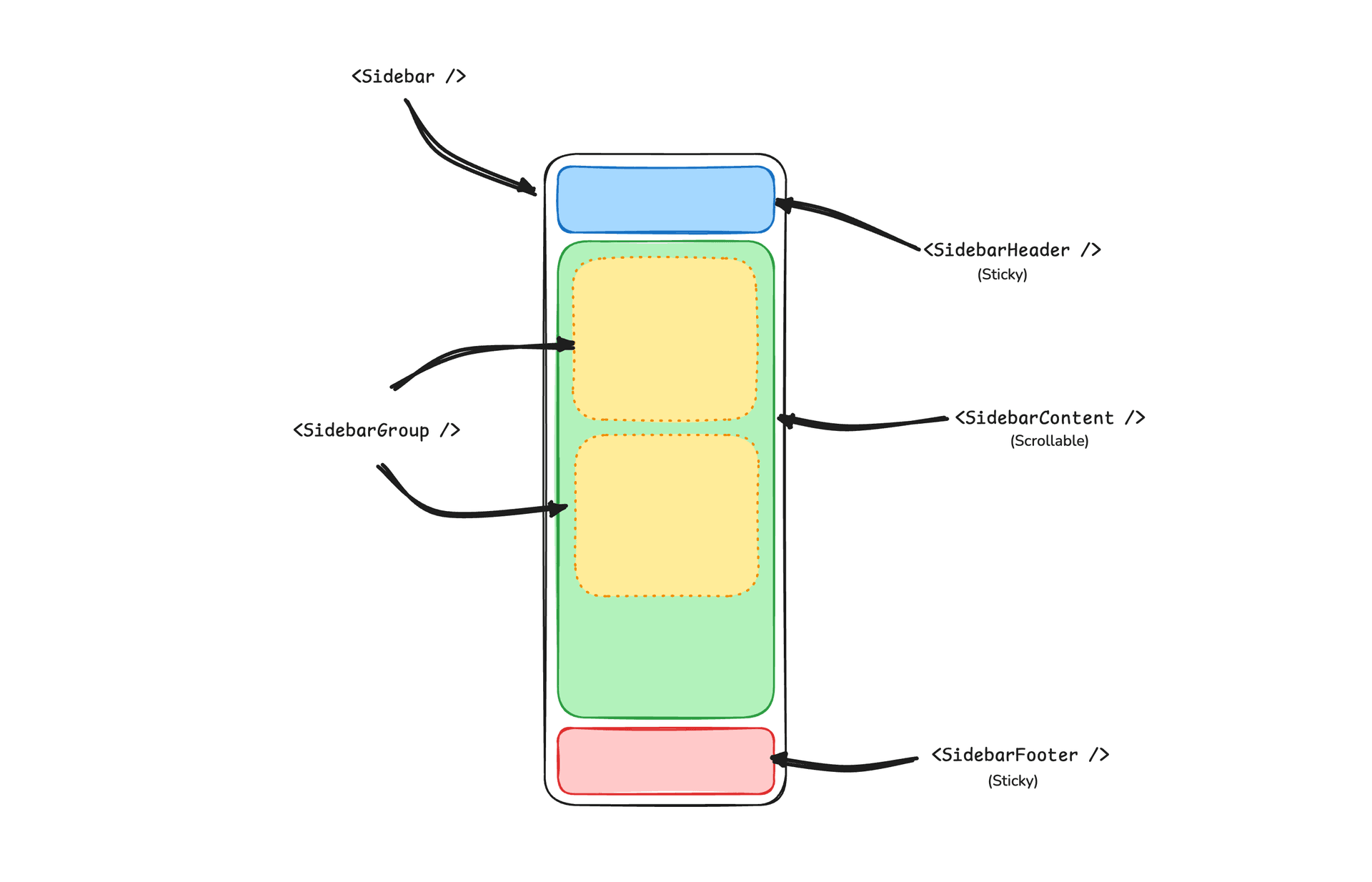
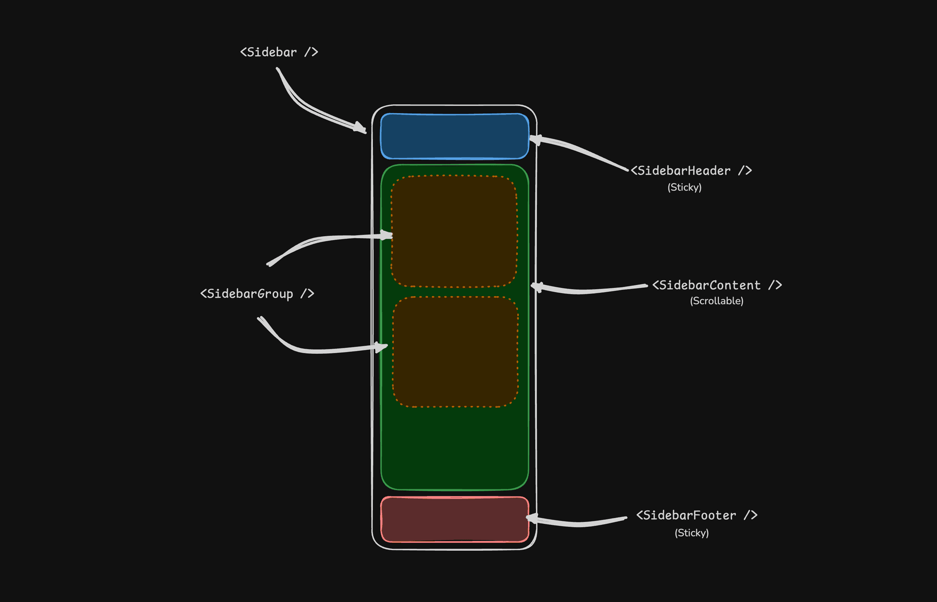
- SidebarProvider — מנהל את מצב הקיפול ומספק את הקשר סרגל הצד לרכיבי הצאצא.
- Sidebar — חלונית סרגל הצד הראשית הניתנת לקיפול.
- SidebarHeader — נצמד לחלק העליון; מיועד למיתוג, כותרות או מחליפי סביבות עבודה.
- SidebarFooter — נצמד לחלק התחתון; מיועד לתפריטי משתמש, הגדרות או פעולות.
- SidebarContent — אזור שניתן לגלול בו בין הכותרת לכותרת התחתונה.
- SidebarGroup — מקבץ ניווט קשור עם אזורי תווית, פעולה ותוכן אופציונליים.
- SidebarMenu / SidebarMenuItem — מבנה תפריט עבור קישורים, תגים, פעולות ותפריטי משנה מקוננים.
- SidebarRail — ידית לשינוי גודל להתאמת רוחב סרגל הצד כאשר רלוונטי.
- SidebarInset — עוטף את התוכן הראשי בעת שימוש בווריאנט
inset. - SidebarTrigger — פקד שמחליף בין מצב פתוח למקופל של סרגל הצד.
SidebarProvider
רכיב SidebarProvider משמש כדי לספק את הקשר סרגל הצד לרכיב Sidebar. עליכם תמיד לעטוף את האפליקציה שלכם ברכיב SidebarProvider.
מאפיינים
| שם | סוג | תיאור |
|---|---|---|
defaultOpen | boolean | מצב הפתיחה של סרגל הצד כברירת מחדל. |
open | boolean | מצב הפתיחה של סרגל הצד (נשלט). |
onOpenChange | (open: boolean) => void | מגדיר את מצב הפתיחה של סרגל הצד (נשלט). |
רוחב
אם יש לכם סרגל צד יחיד באפליקציה, תוכלו להשתמש במשתנים SIDEBAR_WIDTH ו-SIDEBAR_WIDTH_MOBILE בקובץ sidebar.tsx כדי להגדיר את רוחב סרגל הצד.
const SIDEBAR_WIDTH = "16rem"
const SIDEBAR_WIDTH_MOBILE = "18rem"עבור מספר סרגלי צד באפליקציה, תוכלו להשתמש במשתני ה-CSS --sidebar-width ו---sidebar-width-mobile במאפיין style.
<SidebarProvider
style={
{
"--sidebar-width": "20rem",
"--sidebar-width-mobile": "20rem",
} as React.CSSProperties
}
>
<Sidebar />
</SidebarProvider>קיצור מקלדת
כדי להפעיל את סרגל הצד, השתמשו בקיצור המקלדת cmd+b ב-Mac וב-ctrl+b ב-Windows.
const SIDEBAR_KEYBOARD_SHORTCUT = "b"Sidebar
רכיב Sidebar הראשי המשמש להצגת סרגל צד הניתן לקיפול.
מאפיינים
| מאפיין | סוג | תיאור |
|---|---|---|
side | left או right | הצד של סרגל הצד. |
variant | sidebar, floating או inset | הווריאנט של סרגל הצד. |
collapsible | offcanvas, icon או none | מצב הקיפול של סרגל הצד. |
| מאפיין | תיאור |
|---|---|
offcanvas | סרגל צד הניתן לקיפול שנכנס בהחלקה מהצד השמאלי או הימני. |
icon | סרגל צד שמתקפל לכדי אייקונים. |
none | סרגל צד שאינו ניתן לקיפול. |
הערה: אם אתם משתמשים בווריאנט inset, זכרו לעטוף את התוכן הראשי שלכם
ברכיב SidebarInset.
<SidebarProvider>
<Sidebar variant="inset" />
<SidebarInset>
<main>{children}</main>
</SidebarInset>
</SidebarProvider>useSidebar
ההוק useSidebar משמש לשליטה בסרגל הצד.
import { useSidebar } from "@/components/ui/sidebar"
export function AppSidebar() {
const {
state,
open,
setOpen,
openMobile,
setOpenMobile,
isMobile,
toggleSidebar,
} = useSidebar()
}| מאפיין | סוג | תיאור |
|---|---|---|
state | expanded או collapsed | המצב הנוכחי של סרגל הצד. |
open | boolean | האם סרגל הצד פתוח. |
setOpen | (open: boolean) => void | מגדיר את מצב הפתיחה של סרגל הצד. |
openMobile | boolean | האם סרגל הצד פתוח במובייל. |
setOpenMobile | (open: boolean) => void | מגדיר את מצב הפתיחה של סרגל הצד במובייל. |
isMobile | boolean | האם סרגל הצד במצב מובייל. |
toggleSidebar | () => void | מחליף את מצב סרגל הצד. במחשב ובמובייל. |
SidebarHeader
השתמשו ברכיב SidebarHeader כדי להוסיף כותרת נצמדת לסרגל הצד.
<Sidebar>
<SidebarHeader>
<SidebarMenu>
<SidebarMenuItem>
<DropdownMenu>
<DropdownMenuTrigger asChild>
<SidebarMenuButton>
Select Workspace
<ChevronDown className="ml-auto" />
</SidebarMenuButton>
</DropdownMenuTrigger>
<DropdownMenuContent className="w-[--radix-popper-anchor-width]">
<DropdownMenuItem>
<span>Acme Inc</span>
</DropdownMenuItem>
</DropdownMenuContent>
</DropdownMenu>
</SidebarMenuItem>
</SidebarMenu>
</SidebarHeader>
</Sidebar>SidebarFooter
השתמשו ברכיב SidebarFooter כדי להוסיף כותרת תחתונה נצמדת לסרגל הצד.
<Sidebar>
<SidebarFooter>
<SidebarMenu>
<SidebarMenuItem>
<SidebarMenuButton>
<User2 /> Username
</SidebarMenuButton>
</SidebarMenuItem>
</SidebarMenu>
</SidebarFooter>
</Sidebar>SidebarContent
רכיב SidebarContent משמש לעטיפת התוכן של סרגל הצד. כאן אתם מוסיפים את רכיבי SidebarGroup שלכם. ניתן לגלול בו.
<Sidebar>
<SidebarContent>
<SidebarGroup />
<SidebarGroup />
</SidebarContent>
</Sidebar>SidebarGroup
השתמשו ברכיב SidebarGroup כדי ליצור מקטע בתוך סרגל הצד.
ל-SidebarGroup יש SidebarGroupLabel, SidebarGroupContent ו-SidebarGroupAction אופציונלי.
<SidebarGroup>
<SidebarGroupLabel>Application</SidebarGroupLabel>
<SidebarGroupAction>
<Plus /> <span className="sr-only">Add Project</span>
</SidebarGroupAction>
<SidebarGroupContent></SidebarGroupContent>
</SidebarGroup>כדי להפוך SidebarGroup לניתן לקיפול, עטפו אותו ב-Collapsible.
<Collapsible defaultOpen className="group/collapsible">
<SidebarGroup>
<SidebarGroupLabel asChild>
<CollapsibleTrigger>
Help
<ChevronDown className="ml-auto transition-transform group-data-[state=open]/collapsible:rotate-180" />
</CollapsibleTrigger>
</SidebarGroupLabel>
<CollapsibleContent>
<SidebarGroupContent />
</CollapsibleContent>
</SidebarGroup>
</Collapsible>SidebarMenu
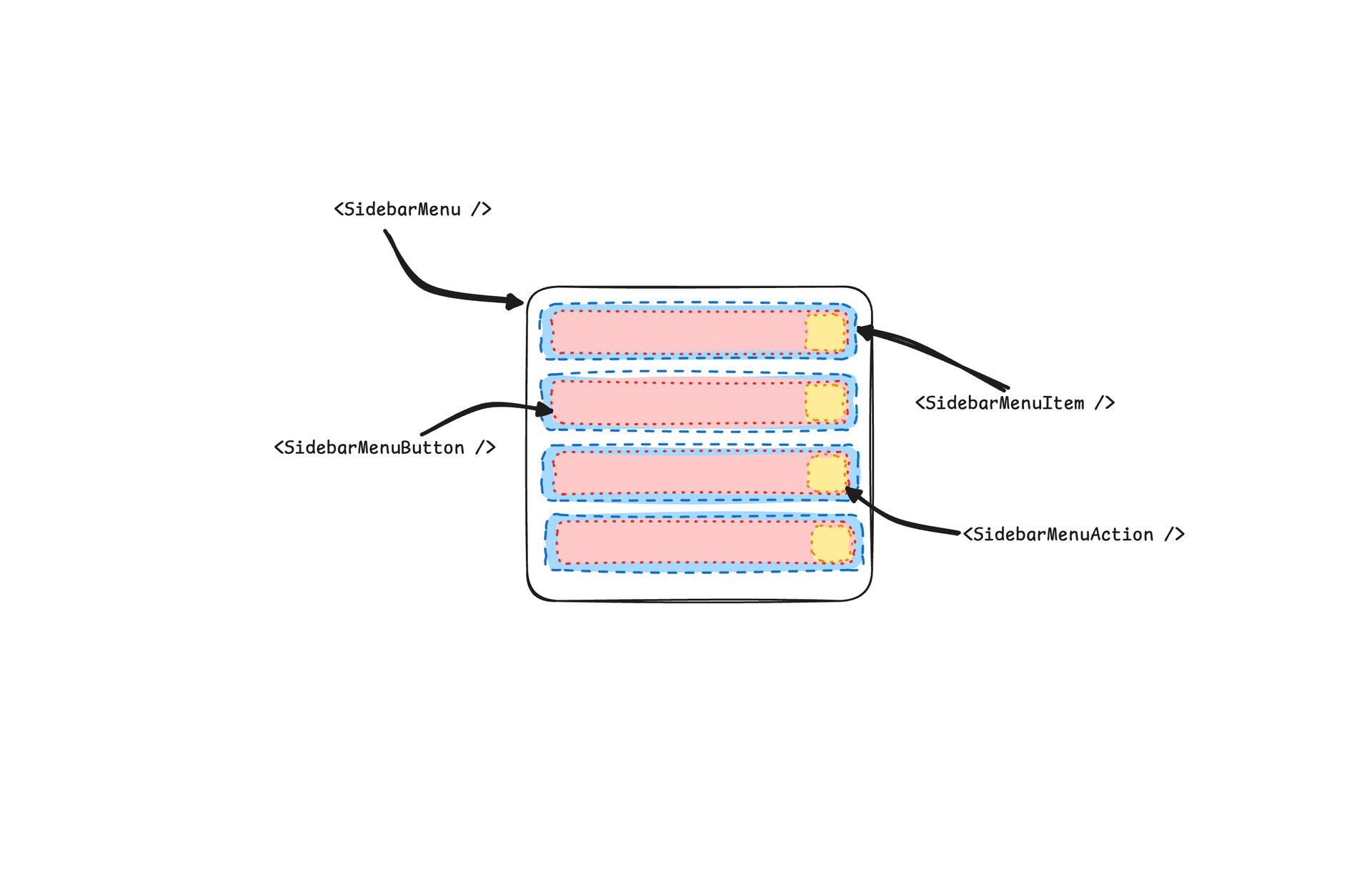
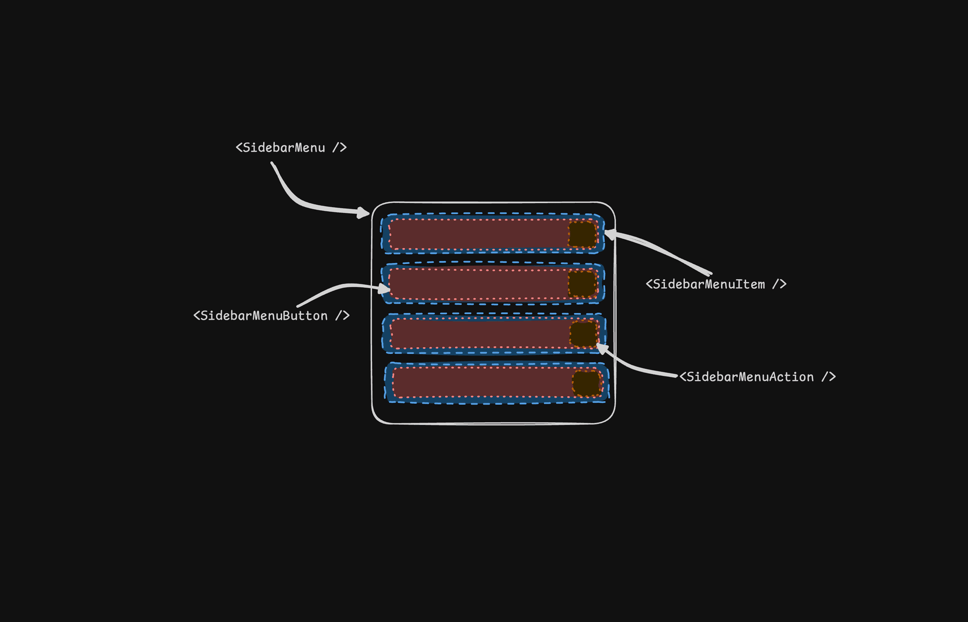
רכיב SidebarMenu משמש לבניית תפריט בתוך SidebarGroup.
<SidebarMenu>
{projects.map((project) => (
<SidebarMenuItem key={project.name}>
<SidebarMenuButton asChild>
<a href={project.url}>
<project.icon />
<span>{project.name}</span>
</a>
</SidebarMenuButton>
</SidebarMenuItem>
))}
</SidebarMenu>SidebarMenuButton
רכיב SidebarMenuButton משמש להצגת כפתור תפריט בתוך SidebarMenuItem.
כברירת מחדל, SidebarMenuButton מציג כפתור, אך תוכלו להשתמש במאפיין asChild כדי להציג רכיב אחר כמו Link או תגית a.
השתמשו במאפיין isActive כדי לסמן פריט תפריט כפעיל.
<SidebarMenuButton asChild isActive>
<a href="#">Home</a>
</SidebarMenuButton>SidebarMenuAction
רכיב SidebarMenuAction משמש להצגת פעולת תפריט בתוך SidebarMenuItem.
<SidebarMenuItem>
<SidebarMenuButton asChild>
<a href="#">
<Home />
<span>Home</span>
</a>
</SidebarMenuButton>
<SidebarMenuAction>
<Plus /> <span className="sr-only">Add Project</span>
</SidebarMenuAction>
</SidebarMenuItem>SidebarMenuSub
רכיב SidebarMenuSub משמש להצגת תפריט משנה בתוך SidebarMenu.
<SidebarMenuItem>
<SidebarMenuButton />
<SidebarMenuSub>
<SidebarMenuSubItem>
<SidebarMenuSubButton />
</SidebarMenuSubItem>
</SidebarMenuSub>
</SidebarMenuItem>SidebarMenuBadge
רכיב SidebarMenuBadge משמש להצגת תג בתוך SidebarMenuItem.
<SidebarMenuItem>
<SidebarMenuButton />
<SidebarMenuBadge>24</SidebarMenuBadge>
</SidebarMenuItem>SidebarMenuSkeleton
רכיב SidebarMenuSkeleton משמש להצגת שלד עבור SidebarMenu.
<SidebarMenu>
{Array.from({ length: 5 }).map((_, index) => (
<SidebarMenuItem key={index}>
<SidebarMenuSkeleton />
</SidebarMenuItem>
))}
</SidebarMenu>SidebarTrigger
השתמשו ברכיב SidebarTrigger כדי להציג כפתור שמחליף את מצב סרגל הצד.
import { useSidebar } from "@/components/ui/sidebar"
export function CustomTrigger() {
const { toggleSidebar } = useSidebar()
return <button onClick={toggleSidebar}>Toggle Sidebar</button>
}SidebarRail
רכיב SidebarRail משמש להצגת פס בתוך Sidebar. ניתן להשתמש בפס זה כדי להחליף את מצב סרגל הצד.
<Sidebar>
<SidebarHeader />
<SidebarContent>
<SidebarGroup />
</SidebarContent>
<SidebarFooter />
<SidebarRail />
</Sidebar>סרגל צד נשלט
השתמשו במאפיינים open ו-onOpenChange כדי לשלוט בסרגל הצד.
export function AppSidebar() {
const [open, setOpen] = React.useState(false)
return (
<SidebarProvider open={open} onOpenChange={setOpen}>
<Sidebar />
</SidebarProvider>
)
}ערכת נושא
אנחנו משתמשים במשתני ה-CSS הבאים כדי לעצב את ערכת הנושא של סרגל הצד.
@layer base {
:root {
--sidebar-background: 0 0% 98%;
--sidebar-foreground: 240 5.3% 26.1%;
--sidebar-primary: 240 5.9% 10%;
--sidebar-primary-foreground: 0 0% 98%;
--sidebar-accent: 240 4.8% 95.9%;
--sidebar-accent-foreground: 240 5.9% 10%;
--sidebar-border: 220 13% 91%;
--sidebar-ring: 217.2 91.2% 59.8%;
}
.dark {
--sidebar-background: 240 5.9% 10%;
--sidebar-foreground: 240 4.8% 95.9%;
--sidebar-primary: 0 0% 98%;
--sidebar-primary-foreground: 240 5.9% 10%;
--sidebar-accent: 240 3.7% 15.9%;
--sidebar-accent-foreground: 240 4.8% 95.9%;
--sidebar-border: 240 3.7% 15.9%;
--sidebar-ring: 217.2 91.2% 59.8%;
}
}עיצוב
הנה כמה טיפים לעיצוב סרגל הצד בהתבסס על מצבים שונים.
<Sidebar collapsible="icon">
<SidebarContent>
<SidebarGroup className="group-data-[collapsible=icon]:hidden" />
</SidebarContent>
</Sidebar><SidebarMenuItem>
<SidebarMenuButton />
<SidebarMenuAction className="peer-data-[active=true]/menu-button:opacity-100" />
</SidebarMenuItem>RTL
כדי להפעיל RTL ב-Neobrutalism, עיינו במדריך ההגדרה של RTL.
יומן שינויים
תמיכת RTL
אם אתם משדרגים מגרסה קודמת של רכיב Sidebar, תצטרכו להחיל את העדכונים הבאים כדי להוסיף תמיכת RTL:
הוסיפו את המאפיין dir לרכיב Sidebar.
הוסיפו את dir למאפיינים המפורקים והעבירו אותו ל-SheetContent עבור מובייל:
function Sidebar({
side = "left",
variant = "sidebar",
collapsible = "offcanvas",
className,
children,
+ dir,
...props
}: React.ComponentProps<"div"> & {
side?: "left" | "right"
variant?: "sidebar" | "floating" | "inset"
collapsible?: "offcanvas" | "icon" | "none"
}) {לאחר מכן העבירו אותו ל-SheetContent בתצוגת המובייל:
<Sheet open={openMobile} onOpenChange={setOpenMobile} {...props}>
<SheetContent
+ dir={dir}
data-sidebar="sidebar"
data-slot="sidebar"
data-mobile="true"הוסיפו את התכונה data-side למכל סרגל הצד.
הוסיפו את data-side={side} לאלמנט מכל סרגל הצד:
<div
data-slot="sidebar-container"
+ data-side={side}
className={cn(עדכנו את מחלקות המיקום של מכל סרגל הצד.
החליפו את מחלקות התנאי המשולש של JavaScript בסלקטורים של תכונות נתונים ב-CSS:
className={cn(
- "fixed inset-y-0 z-10 hidden h-svh w-(--sidebar-width) transition-[left,right,width] duration-200 ease-linear md:flex",
- side === "left"
- ? "left-0 group-data-[collapsible=offcanvas]:left-[calc(var(--sidebar-width)*-1)]"
- : "right-0 group-data-[collapsible=offcanvas]:right-[calc(var(--sidebar-width)*-1)]",
+ "fixed inset-y-0 z-10 hidden h-svh w-(--sidebar-width) transition-[left,right,width] duration-200 ease-linear md:flex data-[side=left]:left-0 data-[side=right]:right-0 data-[side=left]:group-data-[collapsible=offcanvas]:left-[calc(var(--sidebar-width)*-1)] data-[side=right]:group-data-[collapsible=offcanvas]:right-[calc(var(--sidebar-width)*-1)]",עדכנו את מחלקות המיקום של SidebarRail.
עדכנו את רכיב SidebarRail כך שישתמש במיקום פיזי עבור הפס:
className={cn(
- "hover:after:bg-sidebar-border absolute inset-y-0 z-20 hidden w-4 -translate-x-1/2 transition-all ease-linear group-data-[side=left]:-end-4 group-data-[side=right]:start-0 after:absolute after:inset-y-0 after:start-1/2 after:w-[2px] sm:flex",
+ "hover:after:bg-sidebar-border absolute inset-y-0 z-20 hidden w-4 ltr:-translate-x-1/2 rtl:-translate-x-1/2 transition-all ease-linear group-data-[side=left]:-right-4 group-data-[side=right]:left-0 after:absolute after:inset-y-0 after:start-1/2 after:w-[2px] sm:flex",הוסיפו היפוך RTL לאייקון של SidebarTrigger.
הוסיפו className="rtl:rotate-180" לאייקון ב-SidebarTrigger כדי להפוך אותו במצב RTL:
<Button ...>
- <PanelLeftIcon />
+ <PanelLeftIcon className="rtl:rotate-180" />
<span className="sr-only">Toggle Sidebar</span>
</Button>לאחר החלת השינויים הללו, תוכלו להשתמש במאפיין dir כדי להגדיר את הכיוון:
<Sidebar dir="rtl" side="right">
{/* ... */}
</Sidebar>סרגל הצד ימקם את עצמו כראוי ויטפל באינטראקציות הן בפריסות LTR והן בפריסות RTL.
נגישות
אין דפוס WAI-ARIA יחיד לסרגל צד של אפליקציה — התפריט הוא כפתורים וקישורים רגילים שמנווטים עם Tab, לא תפריט ARIA, כך שאין roving של מקשי חצים. במובייל ה-sidebar מרנדר בתוך Sheet, dialog מודאלי לפי דפוס Dialog (Modal) של WAI-ARIA: המוקד נלכד, Escape סוגר אותו, וכותרת ותיאור מוסתרים ויזואלית מכריזים עליו לקוראי מסך. SidebarTrigger מגיע עם aria-label="Toggle Sidebar"; בקרות אייקון בלבד כמו SidebarGroupAction ו-SidebarMenuAction צריכות תוויות sr-only משלהן — הדוגמאות למעלה כוללות אותן.
אינטראקציות מקלדת:
| מקש | פעולה |
|---|---|
Cmd + B / Ctrl + B | מחליפים את ה-sidebar (שנו דרך SIDEBAR_KEYBOARD_SHORTCUT) |
Tab / Shift + Tab | מעבירים מוקד דרך הטריגר, כפתורי התפריט והפעולות |
Enter / Space | מפעילים את כפתור התפריט או הפעולה שבפוקוס |
Escape | סוגרים את ה-sidebar במובייל (Sheet מודאלי) |