
Feature Blocksblocks
Showcase your product's features and benefits. Ready-made React UI blocks with a neobrutalist look — heroes, pricing, auth, dashboards, and more. Preview every screen size, copy the code, or install via your AI agent with our MCP server. Works with Radix UI, Base UI, and React Aria.
- Heroes, pricing & auth
- Preview every breakpoint
- Copy the source
- MCP install ready
- Radix · Base UI · React Aria
- 158 ready-made blocks
- Page sections that ship
- Dashboards & marketing
- Pro unlocks the code
- Drop-in layouts
Browse every layout
Feature Blocks
11 blocks — open any card for a full-screen preview, the code, and install steps.
- 01Pro
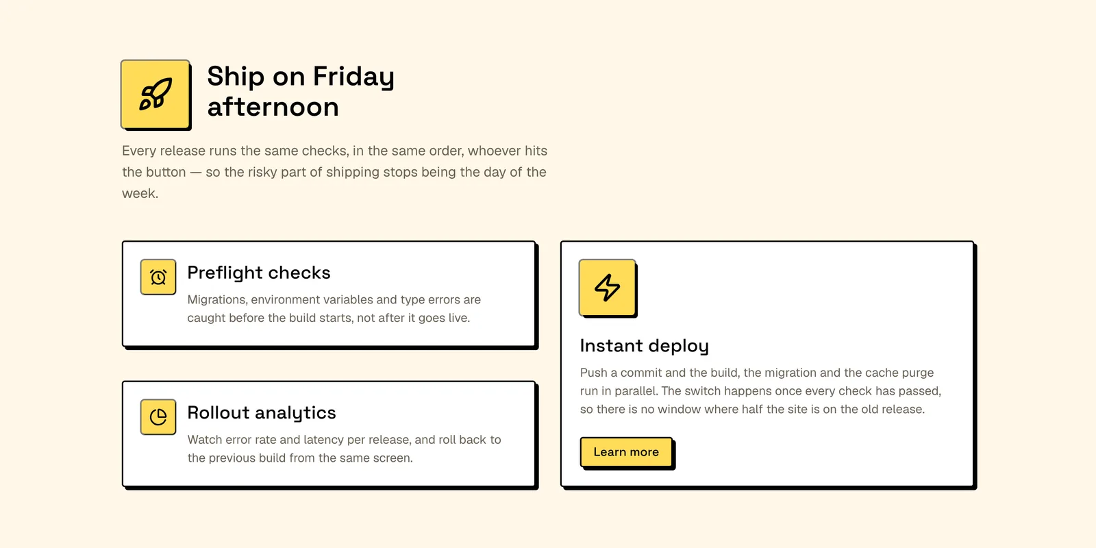
Asymmetric Feature Cards
Two short cards stacked beside one tall card that carries the only call to action, under a heading and icon badge. React and Tailwind — rank three features.
- 02Pro
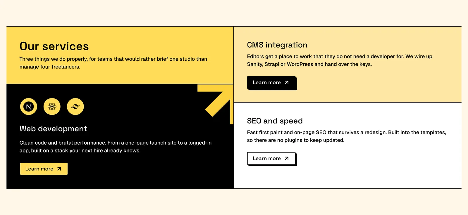
Bento Services Feature Grid
Bento panels running edge to edge with the rules as the layout, each with its own surface colour, copy and button. React and Tailwind — brief your services.
- 03Pro
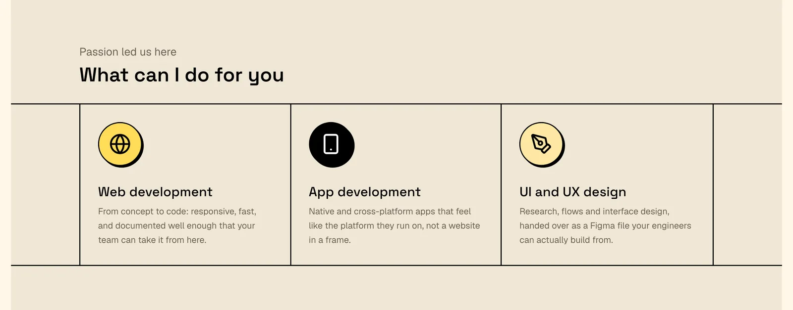
Bordered Services Feature Row
No card and no fill: three ruled cells whose round icon tiles flatten as the cell warms on hover. React and Tailwind — quiet enough for the foot of a page.
- 04Pro
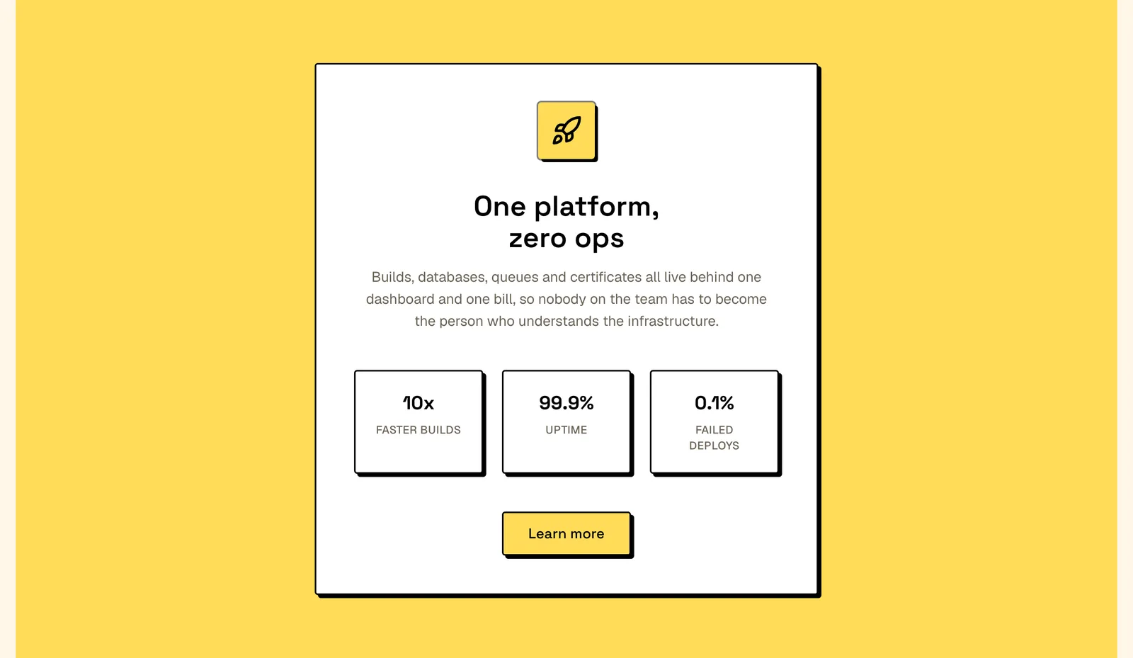
Centered Feature Stats Card
One centred panel on a full-width colour band, carrying an icon badge, a claim, three stat cards and a button. React and Tailwind — use it as a breather.
- 05Pro
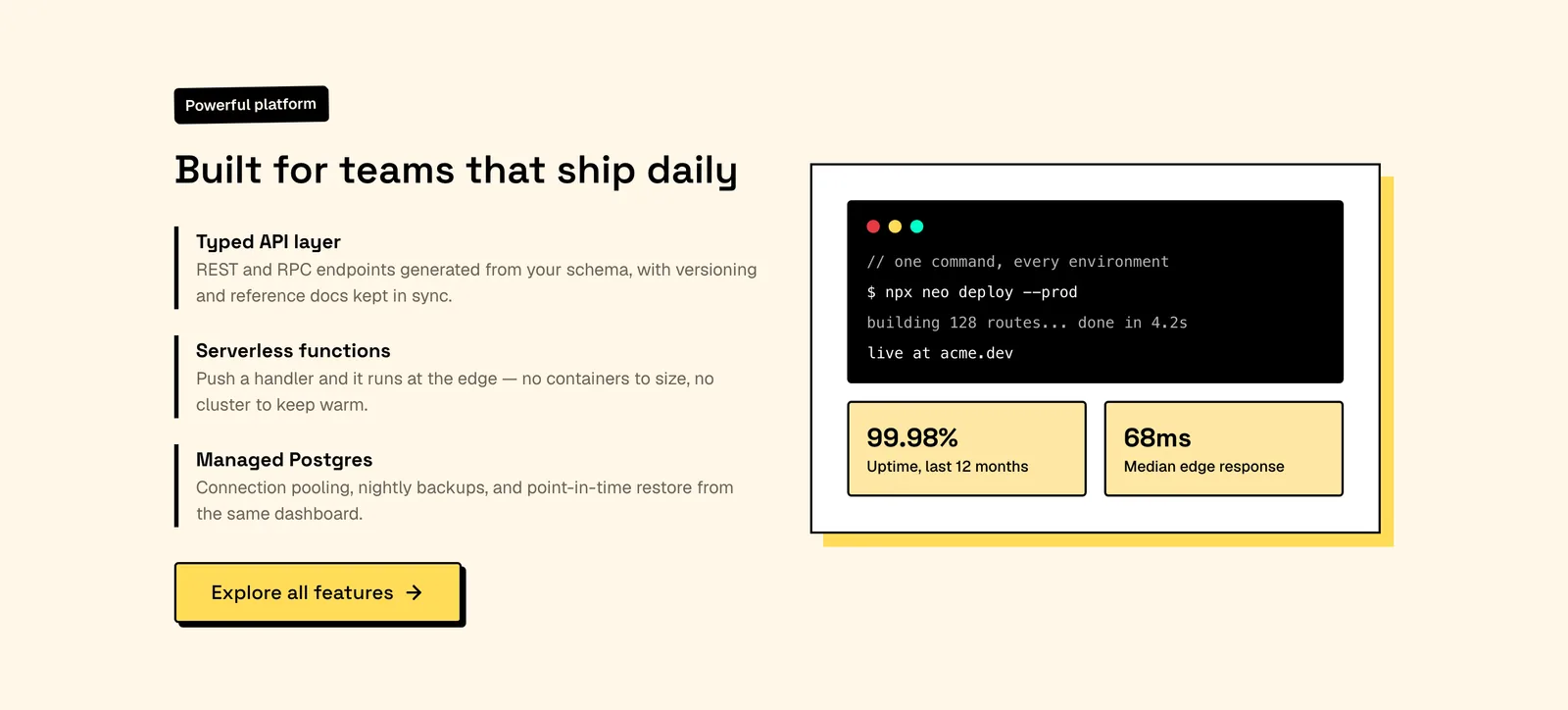
Code Preview Feature Split
Proof by terminal: three ruled capabilities beside a replayed deploy log and two uptime tiles on an offset block. React and Tailwind — paste your own output.
- 06Pro
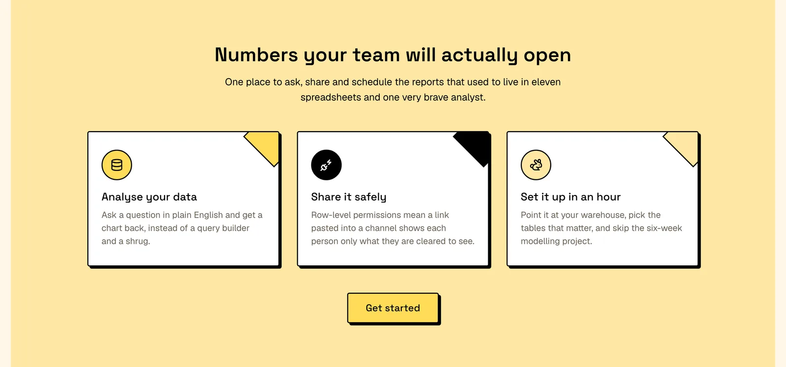
Icon Card Feature Trio
Peer cards on a tinted band, each with a round icon tile and a rotated square clipped into its corner. React and Tailwind — recolour each surface pair.
- 07Pro
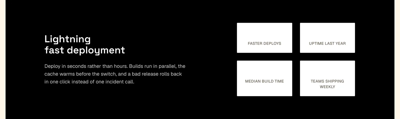
Metrics Band Feature Section
A two-line claim beside four metric cards in a two-by-two grid on a high-contrast band, with nothing to click. React and Tailwind — drop it between sections.
- 08Pro
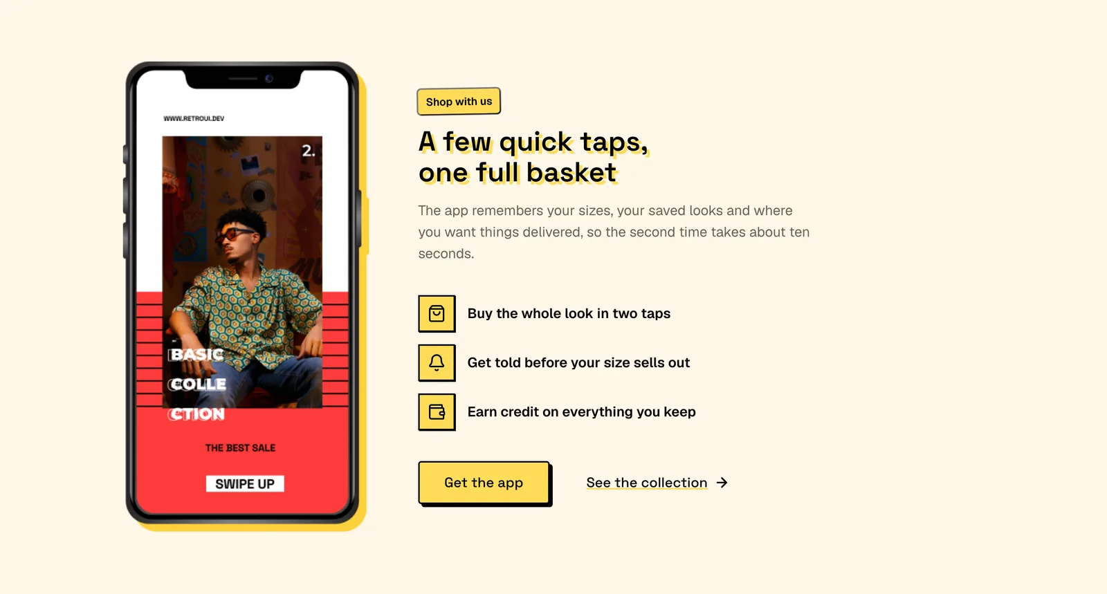
Mobile App Feature List
A phone mockup beside three benefit rows written as outcomes, an offset-shadow headline and two calls to action. React and Tailwind — export a new mockup.
- 09Pro
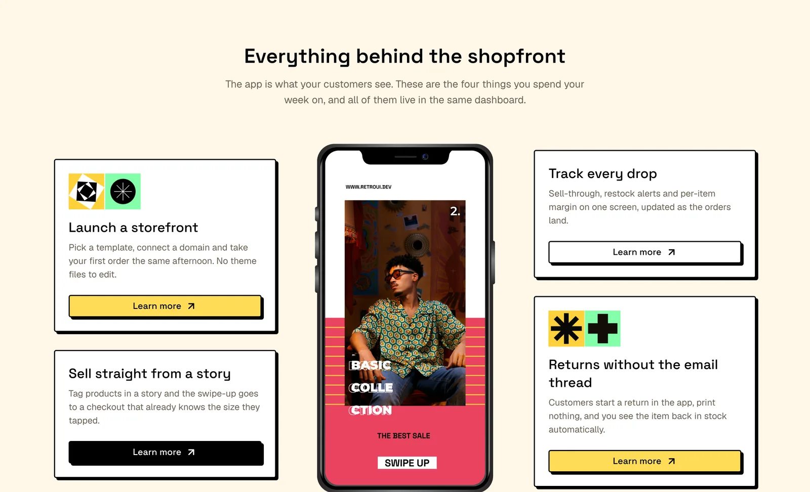
Phone Mockup Feature Grid
Four cards flanking a centred phone mockup, each ending in its own full-width button, ornaments on the diagonal. React and Tailwind — keep the count even.
- 10Pro
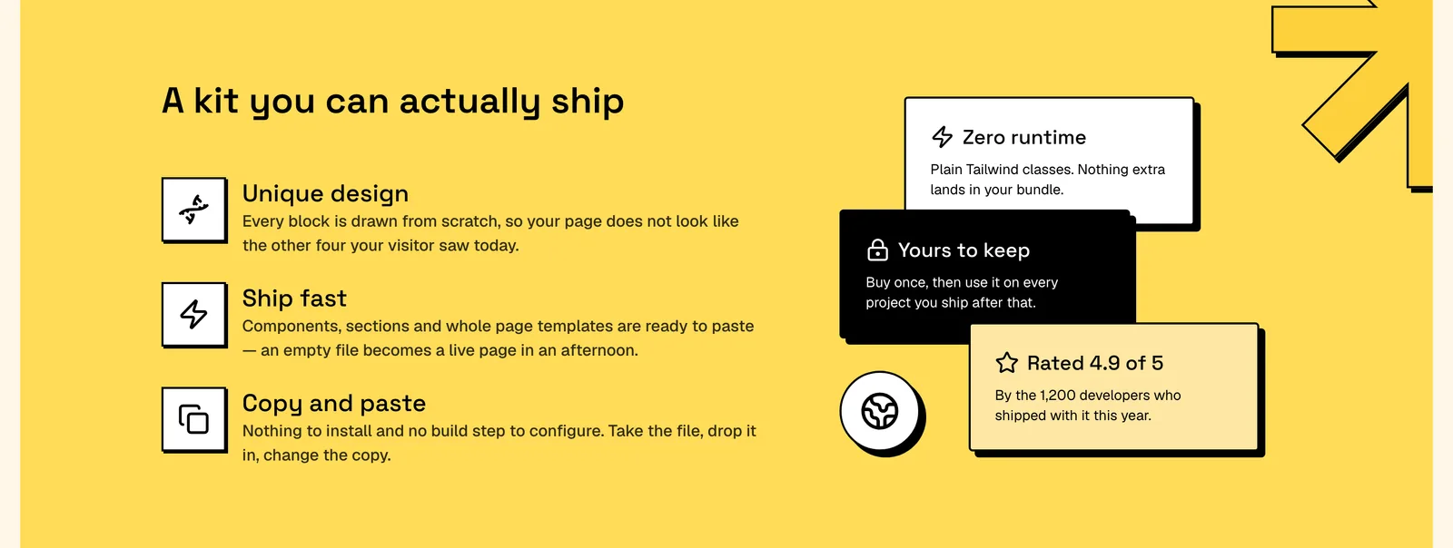
Stacked Cards Features
Icon rows arguing the case on a full-bleed colour band, answered by a collage of overlapping proof cards. React and Tailwind — park it under the hero.
- 11Pro
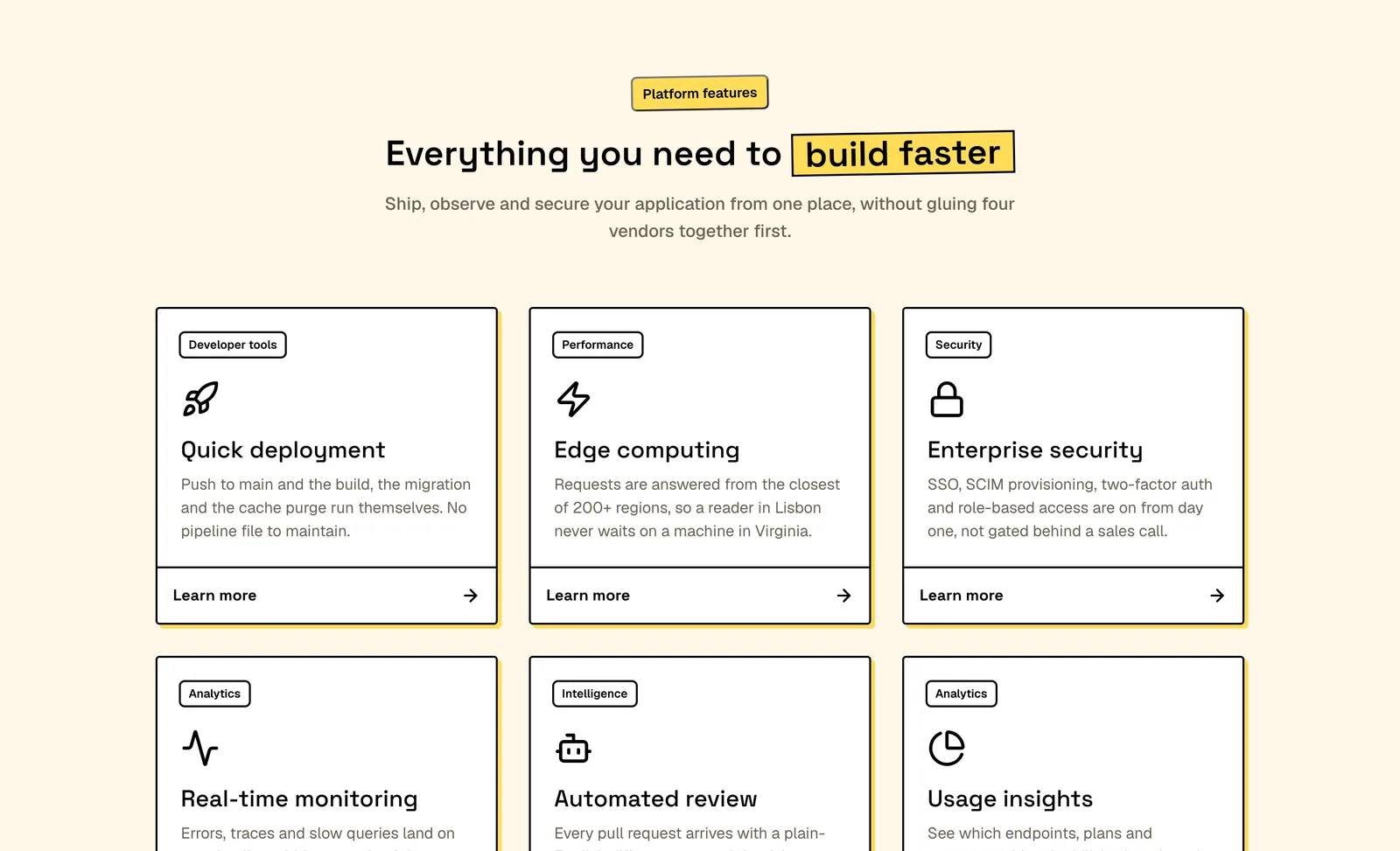
Tagged Feature Card Grid
Six cards that are each a single link, tagged by category and closed by a footer bar whose arrow slides on hover. React and Tailwind — write six or twelve.